Playing About with ggplot
I’ve turned the spellchecker on right away for this post.
After spending the last few hours playing around with some data in R, I’ve managed to produce my first pretty looking graphic using ggplot2.
The main complication in producing this was fiddling around with the dataframe, getting it in the correct format so that the different colours of the line came out automatically.
Initially, it started off as:
Timestep | Zero | One | Two
However this gave some complications; when ggplot was grouping the data, I had to refactor the data to:
Timestep | Population | Mutation
This meant that I didn’t have to start manually setting colours, instead it was all decided for me. I like to follow the LaTeX school of thought by letting the software decide on the aesthetics that work best, rather that leaving it up to the user.
Overall, it resulted in the following plot:
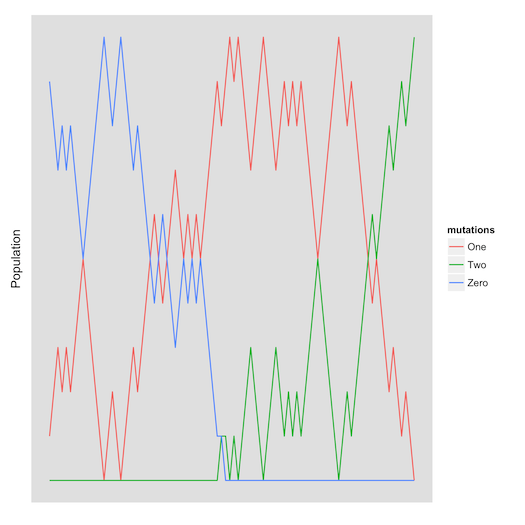
The data came from a basic and rough implementation of the Gillespie Algorithm. More comments on the physics behind it to follow.