Adding Football Crests to Scatter Plots in R
Last week I
updated my overachieving visualisations and replaced dots and labels
with the appropriate crests of the football club. This post is showing
you how to use ggplot to do the same. In short, I copied Michael
Lopez’s tutorial from
here.
This post is a bit of a rehash of his work, but I’m adding value by making the crests
available on Github and
showing you how to download them so everyone can use the crests
easily.
Enjoy these types of posts? Then you should sign up for my newsletter.
If you are using ggplot then your normal scatter and label plot command will look like this:
ggplot(modelSummary,
  aes(x=PreMatchSpread, y=PostMatchSpread, label=Team)) +
  geom_point() +
  geom_label_repel()

geom_point adds points and geom_label_repel() from the ggrepel
package adds the labels to avoid overlapping.
Nice enough but we can do better.
To replace the points and labels with an image of the teams crest we
will use the ggimage package so we need a suitable image for each
team. Thankfully, wikipedia has a svg image of each teams crest
available. We don’t even need to download the image, we just need a
url of where the image lives and will let ggimage handle the rest.
For Spurs, we go on their wikipedia page and click through to the crest twice and copy that url to use that as the image aesthetic.
ggplot(data.frame(),
  aes(x=1, y=1,
        image="https://upload.wikimedia.org/wikipedia/en/b/b4/Tottenham_Hotspur.svg")) +
  geom_image()
Simple. At least for one crest. What about all the other teams?
To save you the hassle of going through all the wikipedia articles, I’ve created a GitHub repository that stores them and I can keep updated. So you simply just read that the file from GitHub and you’ve got all the crests at your fingertips.
crests <- read_csv("https://raw.githubusercontent.com/dm13450/FootballCrests/main/crest.csv")
modelSummary <- left_join(modelSummary, crests, by="Team")

ggplot(modelSummary,
  aes(x=PreMatchSpread, y=PostMatchSpread, label=Team)) +
  geom_vline(xintercept = 0) +
  geom_hline(yintercept = 0) +
  xlab("Pre Match Spread") +
  ylab("Post Match Spread") +
  geom_image(aes(image=URL))
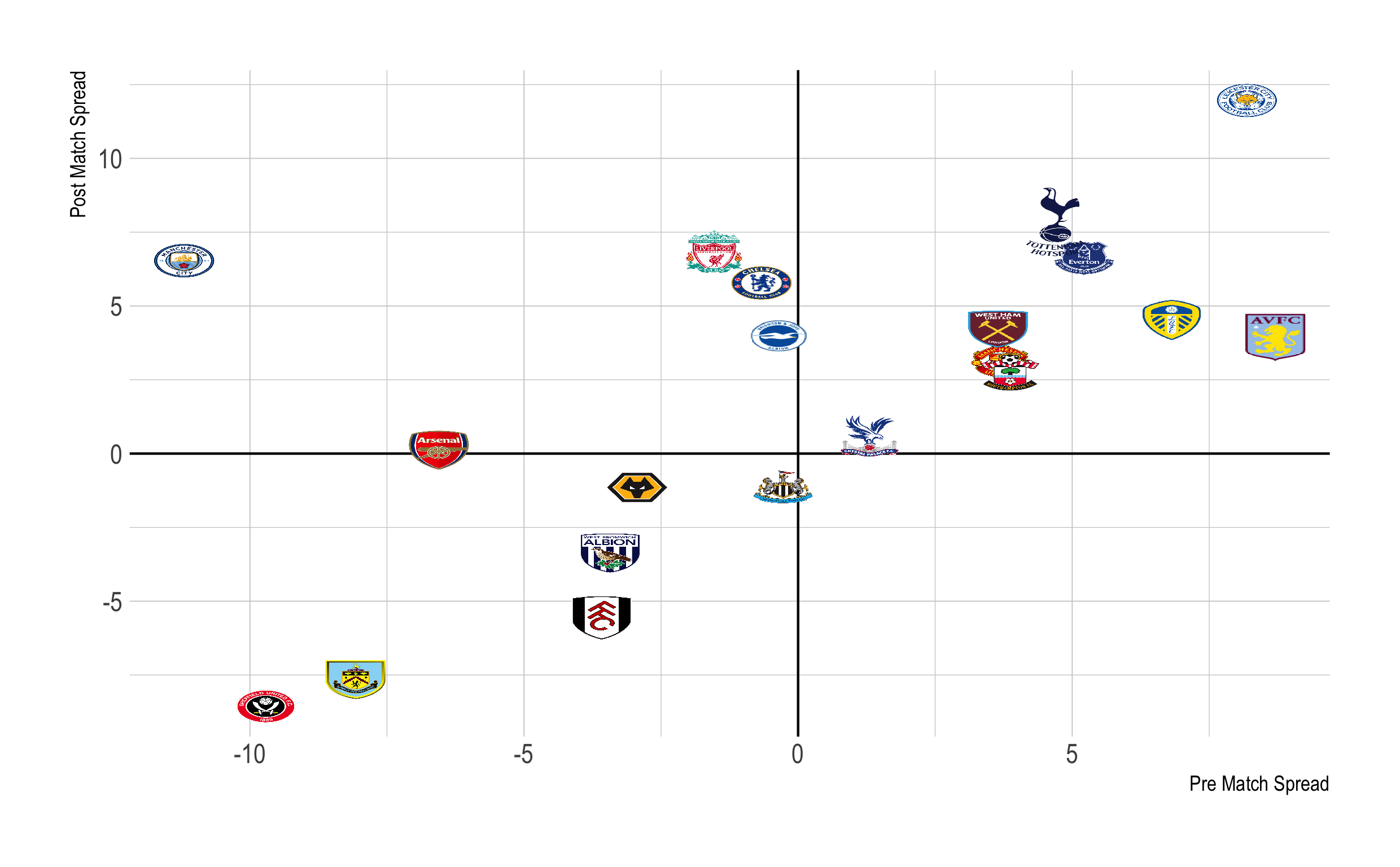
Done. From boring points to the proper crests, a visualisation improvement.
This is specific to football crests but hopefully you can see how any url can replace a point. Is your team in the csv or have I been slacking in covering everyone? Feel free add your own with a pull request to the repository or tweet at me and I’ll get your team added.