Referee Tracking Data and Machine Learning
Tracking data is the alleged holy grail in football analysis. But what about if we have a referee’s position throughout a match? What can we do with this kind of data?
In this post I’ll be exploring my positioning using data I’ve collected in a match. I will go through the process of loading, cleaning and using a few machine learning techniques to make sense of where I was on the pitch. I’ll be using a python notebook and various packages to do the work.
Firstly, lets load the necessary packages for our analysis.
%matplotlib notebook
import pandas as pd
import numpy as np
import matplotlib.pyplot as plt
from sklearn.decomposition import PCA
from sklearn.neighbors import KernelDensity
We then read the data in and produce our first exploratory scatter plot.
game = pd.read_csv("Amargh_vs_Bangor.csv")
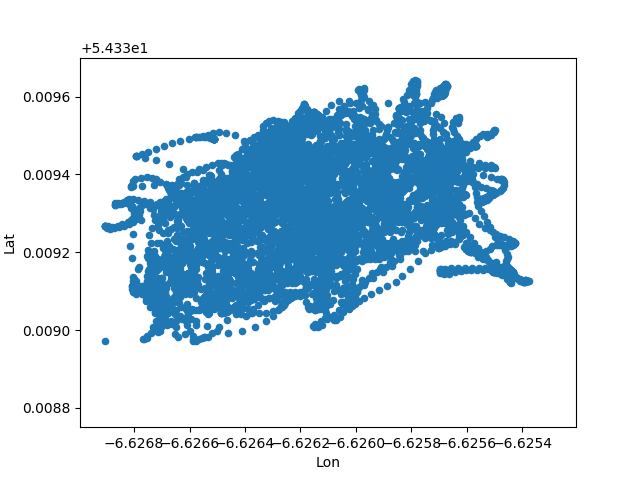
game.plot(kind='scatter', x='Lon', y='Lat')
We can see that it is a very dense collection of points. With 6042 rows over approximately 90 minutes we can see that my position was updated roughly once a second.
We now need to transform the data. We want to centre and scale it and then apply Principle Component Analysis (PCA) so that we can compare it to future matches and all the other data that I have.
lon_train = (game.Lon - np.mean(game.Lon)) /np.sqrt(np.var(game.Lon))
lat_train = (game.Lat - np.mean(game.Lat)) /np.sqrt(np.var(game.Lat))
Performing a PCA is extremely simple in Python.
X = np.vstack([lon_train, lat_train])
pca = PCA(n_components=2)
X_r = pca.fit(X.T).transform(X.T)
We can now plot the results of our transforms.
fig, axs = plt.subplots()
plt.scatter(X_r[:,0], X_r[:,1])
print np.subtract(*np.percentile(X_r[:,0], [97, 3]))
print np.subtract(*np.percentile(X_r[:,1], [97, 3]))4.21437466719
3.03966340482
By looking at the quantiles of the data, I’m hazarding a guess that the x-axis is the length of the pitch. Football pitches are longer than wider, therefore the axis with wider quantiles will be along the length of the pitch.
Whenever we are performing such inferences it is always usually a good idea to rescale your data to zero mean and unit standard deviation. In our case, this isn’t going to change the fundamental structure in our data, instead it just moves the centre to (0,0). As for applying the PCA transform, we want to be able to be able to compare the tracking data of all our games, if we didn’t rotate the data, we would have to correct for the different orientations of the pitch. By applying the PCA transform, we are making sure that all the variation is along both axis regardless of where the pitch is in relation to the longitude and latitude.
Now we perform our kernel density estimation using the appropriate functions from sklearn. We chose a bandwidth arbitrarily. It is possible to learn the optimal bandwidth for the data, but I shall save that for another blog post.
kde = KernelDensity(kernel="gaussian", bandwidth=0.5)
kde.fit(X_r)
To plot our estimation we must create a grid spanning the pitch area and calculate the kernel density at each of these points. A contour plot then shows the regions of high density and therefore the areas of the pitch that my movement was concentrated.
x_plot = np.linspace(-3.5, 3.5, 500)
y_plot = np.linspace(-3.5, 3.5, 500)

xx,yy = np.meshgrid(x_plot, y_plot)

xy = np.vstack([yy.ravel(), xx.ravel()])

z = np.exp(kde.score_samples(xy.T))
z = z.reshape(xx.T.shape)

levels = np.linspace(0, z.max(), 50)fig, ax = plt.subplots()
ax.contourf(xx,yy,z,level=levels)
ax.spines['left'].set_position('center')
ax.spines['left'].set_color("white")
ax.spines['right'].set_color('none')
ax.spines['bottom'].set_position('center')
ax.spines['bottom'].set_color('white')
ax.spines['top'].set_color('none')
ax.spines['left'].set_smart_bounds(True)
ax.spines['bottom'].set_smart_bounds(True)
ax.tick_params(axis="both", bottom="off", which="both", labelbottom='off', labelleft="off", left="off")As we can see, the density of points seems to be highest slightly off centre. This might be evidence for a diagonal patrol path.
Overall, this work flow shows how easy it is to clean tracking data and apply some basic machine learning techniques. We’ve gone from an ineligible cluster of points to a pretty looking contour graph.