Extreme Values and the VIX
The financial markets have livened up in the last week. After a sudden spike in the VIX index last Monday, world markets are teetering on the edge of correction territory. This spike in the VIX also lead to the liquidation of the XIV ETN. But how unusual was this spike in the VIX? In this blog post we examine the distribution of the VIX index and apply two simple models to gauge the probability of large spikes in the VIX.
Enjoy these types of posts? Then sign up for my newsletter.
Let us start with explaining the VIX index. You can think of the VIX as an indicator for large moves in stock prices. A high VIX value means that there currently a large chance of a big change in stock prices. Whereas a lower VIX indicates prices are unlikely to change by much. A lower VIX is preferable and sometimes the VIX is referred to as ‘the fear gauge’ of the stock market. Therefore, it is important to understand how the VIX can change over time and what types of values we might see.
require(knitr)
require(readr)
require(tidyr)
require(dplyr)
require(ggplot2)
require(bayesplot)
require(rstan)
options(mc.cores = parallel::detectCores()-3)
rstan_options(auto_write = TRUE)
We begin our analysis with some data. The daily levels of the VIX are available on Yahoo Finance. We download these and load the data.
rawData <- read_csv("^VIX.csv")
ggplot(rawData, aes(x=Date, y=Open)) + geom_line()
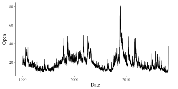
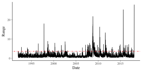
When we look at the opening prices over time, we can see that the VIX reached its highest levels in 2008 around the time of the financial crisis. We can see the large spike from Monday is really quite an anomaly. However, these are just the opening prices. We are interested in the intra-day spikes, i.e. the difference between its highest and lowest values in the day. Days where this range are low are quite days, whereas those with high spikes are going to indicate interesting days.
Using dplyr its trivial to add the new column.
rawData %>% mutate(Range = High-Low) -> cleanData
ggplot(cleanData, aes(x=Date, y=Range)) + geom_line()
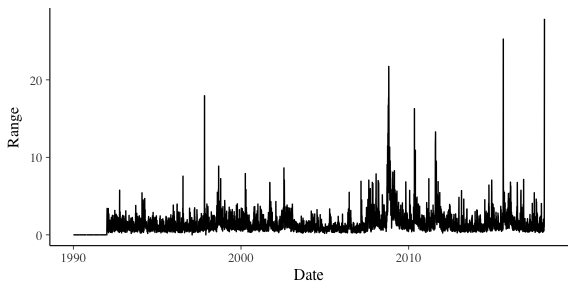
From this definition of the range, we can see that Monday saw a bigger intra-day than anything previously seen.
cleanData %>% filter(Range != 0) -> cleanData
When we look at the distribution of these ranges we find that it is heavy tailed. The second graph shows the counts on a log scale.
ggplot(cleanData, aes(x=Range)) + geom_histogram(binwidth = 1)
ggplot(cleanData, aes(x=Range)) + geom_histogram(binwidth = 1) + scale_y_log10()
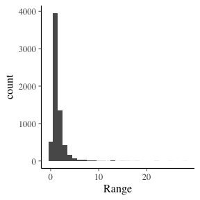
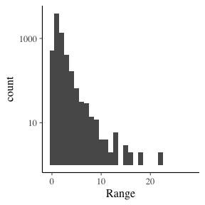
The majority of the ranges are less than 5, yet we’ve seen plenty of +10 moves.
quantile(cleanData$Range, probs=c(0.95, 0.97, 0.99))
##      95%      97%      99%
## 3.599998 4.318399 7.062800
We can see here that 5% of the data is greater than 3.6. It is very fat tailed. With so many outliers, its going to be tricky to model.
Modelling the VIX Extremes
If we treated all the ranges as i.i.d from a log-normal distribution, how would it look? This is easy to implement using Stan.
lognormalModel <- stan_model("lognormal.stan")

lnData <- list()
lnData$N <- length(cleanData$Range)
lnData$y <- cleanData$Range

lognormalSamples <- sampling(lognormalModel, data=lnData)
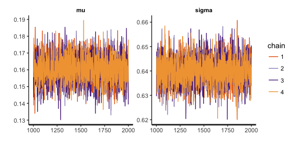
stan_trace(lognormalSamples, pars=c("mu", "sigma"))
yPred <- rstan::extract(lognormalSamples, pars=c("yPred"))$yPred
ppc_dens_overlay(cleanData$Range, yPred[1:150,]) + coord_cartesian(xlim=c(0,10))
ppc_stat(cleanData$Range, yPred, stat="max")
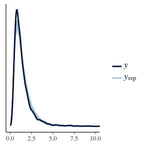
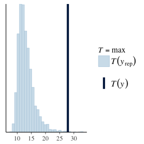
Here we have used the fitted parameters to replicate the data. We then compare the distribution of the replicated sets to the real data and find that its a reasonable fit. It doesn’t line up perfectly, but for a first model it looks good. However, with our second plot we are calculating the maximum value of each replicated data set to arrive at a distribution, we then calculate the maximum of our real data set and see how that compares. As the second plot shows, the the real maximum could not have come from the maximum of simulated samples, and this is enough evidence that we should reject the log-normal model. Especially as in a risk context we are interested in the large values of the VIX. By using a log-normal model we would be severely underestimating the probability of a large move, which could have disastrous consequences.
Instead, we can take a slightly different approach.
Extreme Values and Points Over Threshold.
If we consider the maximum value of the VIX we can re-think this problem in an ‘extreme value’ context. Instead of modelling all the values of the VIX, let us set some threshold μ and use all the times that the VIX was greater than this threshold as our sample. We are assuring that these values are coming from the tail of the distribution and focusing on modelling that.
rangeQuantiles <- quantile(cleanData$Range, probs=c(0.95))
We chose our threshold as the value of which 5% of the data is over. In this case that is all the times the range of the VIX was greater than 3.599998.
ggplot(cleanData, aes(x=Date, y=Range)) + geom_line() + geom_hline(yintercept = rangeQuantiles, colour="red", linetype=4)
Now from extreme value theory, we can approximate the tail of a distribution using the Generalised Pareto distribution. In Stan, this is the pareto_type_2 family of functions. Again, it is incredibly easy to write the Stan program to sample from this distribution.
paretoData <- list()
cleanData %>% filter(Range > rangeQuantiles) %>% pull(Range) -> paretoData$y
paretoData$N <- length(paretoData$y)
paretoData$mu <- rangeQuantiles
paretoModel <- stan_model("pareto.stan")
paretoSamples <- sampling(paretoModel, paretoData)
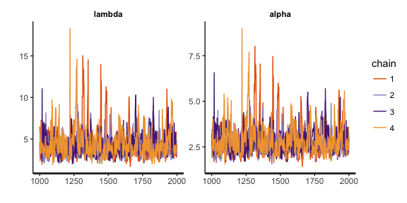
stan_trace(paretoSamples, pars = c("lambda", "alpha"))
yRep <- rstan::extract(paretoSamples, pars=c("yPred"))$yPred
ppc_dens_overlay(paretoData$y, yRep[1:100,]) + coord_cartesian(xlim=c(0, 50))
ppc_stat(paretoData$y, yRep, "max", binwidth = 10) + coord_cartesian(xlim=c(rangeQuantiles[1], 200))
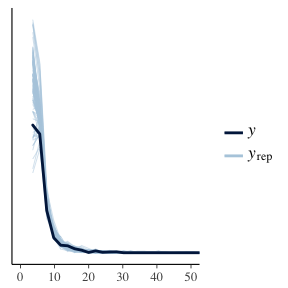
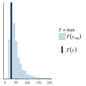
We apply the same methodology of before, looking at the distribution of the replicated data and the distribution of the maximums of this data. We can see that in fact, this seems a reasonable model. Both the replicated datasets, and maximums are looking good.
Now we can see that the true risk of the VIX range on a per day basis. There is a non-zero probability of a change of 200. We have simulated for 4000 days and at Now considering the highest ever value of the VIX is 89.529999 and the lowest is 8.56 its not too far fetched to think that a range value of 100 is impossible. Although its effects would be pretty catastrophic.
To recap:
- We have calculated the intra-day range of the VIX by subtracting the difference between the high and low values.
- We fitted the ranges using lognormal distribution. This failed when we looked at the maximum values of the data.
- We used extreme value theory to set a threshold and model all the
ranges over this threshold as coming from a Generalised Pareto
Distribution.
- This extreme value model appears viable as its distribution of maximums appears to be similar to the true maximum.
- From this we can conclude that there is a non-zero probability of the VIX spiking by over 100 points in a day.
The Stan code for the lognormal model can be found here and for the Pareto model here.