Exploring the Isle of Man TT
The Isle of Man TT (Tourist Trophy) is an infamous bike race. The course is a 37 mile loop around the Isle of Man and the current record is just under 17 minutes with an average speed of 134 mph. The race is also famed for its lethality and there are multiple deaths per year. Riders choosing to race are taking an extraordinary risk. It is a dataset for the morbidly curious.
Enjoy these types of posts? Then sign up for my newsletter.
In this post I will be making use of these R packages. Download them all from CRAN to follow along.
library(knitr)
library(rvest)
library(dplyr)
library(tidyr)
library(lubridate)
library(ggplot2)
library(rstanarm)
library(bayesplot)
I will walk through downloading the data from Wikipedia, performing some exploratory analysis before attempting to the model the number of deaths of time.
Scraping the Data
The list of deaths is recorded in a table on Wikipedia. It is an ever growing table that records the date, the rider, whereabouts the death occurred, the race and the motorbike. It’s an excellent dataset to study the number of fatalities over time.
Using the rvset package, we are able to get the table into a data frame with minimal effort.
url <- "https://en.wikipedia.org/wiki/List_of_Snaefell_Mountain_Course_fatalities"
read_html(url) %>% html_nodes('table') %>% html_table() -> readTable
deathsRaw <- readTable[[1]]
tail(deathsRaw, 3) %>% kable
| No | Rider | Date | Place | Race | Event | Machine | |
|---|---|---|---|---|---|---|---|
| 252 | 252 | Andrew Soar | 10 June 2016[343] | Keppel Gate | 2016 Isle of Man TT | Senior TT | 1000cc GSX-R Suzuki[344] |
| 253 | 253 | Davey Lambert | 6 June 2017[345] | Greeba Castle | 2017 Isle of Man TT | Superbike TT | 1000cc Kawasaki[346] |
| 254 | 254 | Jochem van den Hoek | 7 June 2017[347] | 11th Milestone[348][349] | 2017 Isle of Man TT | Superstock TT | 1000cc Honda[350] |
The raw data still contains the citation brackets though, there needs to be a cleaning step before we can start exploring the data.
Cleaning the Data
We need a function to remove the citation brackets and the apply it to each of the columns.
testString <- deathsRaw$Date[1]
print(testString)
## [1] "27 June 1911[4]"
Using regular expressions we can replace all incidents of square brackets with blank spaces using the gsub function. I use the reg-ex website, regxr.com to get a visual feel of what the reg-ex is selecting.
removeBrackets <- function(string){
  gsub("\\[\\w+\\]", "", string)
}
removeBrackets(testString)
## [1] "27 June 1911"
The reg-ex works, so now we apply it to all the columns. We also want to remove the No column that indexes the row number and we convert the date strings into date types using the lubridate package. Its able to automatically detect the format of the string and apply the appropriate conversion. Finally, we have to drop one NA value as one of the accidents doesn’t have a day recorded, just a month and year.
deathsRaw %>% mutate_all(removeBrackets) %>% select(-No) %>% mutate(Date=dmy(Date)) %>% drop_na(Date) -> deathsClean
## Warning: 1 failed to parse.
head(deathsClean, 3) %>% kable
| Rider | Date | Place | Race | Event | Machine |
|---|---|---|---|---|---|
| Victor Surridge | 1911-06-27 | Glen Helen | 1911 Isle of Man TT | Practice | Rudge-Whitworth |
| Frank R Bateman | 1913-06-06 | Creg-ny-Baa | 1913 Isle of Man TT | Senior TT | 499cc Rudge |
| Fred Walker | 1914-05-19 | St Ninian’s Crossroads | 1914 Isle of Man TT | Junior TT | Royal Enfield |
We’ve now got a clean dataset ready to explore.
Exploring the Data
We want to see how the number of deaths aggregates over the year. We add a Year variable to the dataset and tally up the total number of deaths per year.
deathsClean %>% mutate(Year=year(Date)) -> deathYears
ggplot(deathYears, aes(x=Year)) + geom_bar() + ggtitle("Deaths By Year")
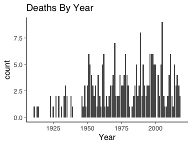
Here we can see there appears to be a steady in increase in the total number of deaths per year. Only two years since 1950 have had 0 deaths. A depressing thought really, every year, its almost guaranteed that someone is going to die. For all the riders taking part, you’ve got to hope that it is not your unlucky year.
Modeling the Data
We now want to model the data and understand how the number of deaths is changing over time. We will start by looking at the number of deaths per year, before proceeding to assume that the fatalities are realisations of a point process.
The number of fatalities in each year is an integer, with maximum 9 and minimum 0. Therefore we can use Poisson regression.
Baseline model
With any data modelling, we want a baseline model to refer back to. This ensure that each layer of complexity is beneficial to the model. For data such as this, a sensible baseline model is one where we think the number of fatalities follows just an average value.Under this baseline model, we think that all the observations are i.i.d from a Poisson distribution with rate \(\lambda\). This is a simple Bayesian problem with conjugate posterior.
We pull the vector of deaths per year from the data frame and then draw from the posterior distribution.
deathYears %>% group_by(Year) %>% tally %>% pull(n) -> deathsPerYear
lambda0 <- rgamma(1000, sum(deathsPerYear) + 0.01, length(deathsPerYear) + 0.01)
We can add this line onto a deaths per year plot, with 95% credible intervals.
ggplot(deathYears, aes(x=Year)) + geom_bar() + ggtitle("Deaths By Year") + geom_hline(yintercept = mean(lambda0), colour="red") + geom_hline(yintercept = quantile(deathsPerYear, prob=0.05), linetype=2, colour="red") + geom_hline(yintercept = quantile(deathsPerYear, prob=0.95), linetype=2, colour="red")
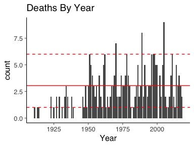
As a baseline model, it is constant overtime and should be easily improved upon.
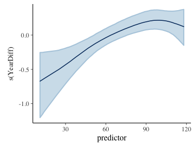
Bayesian GAM Model
An obvious extension to the baseline model is to allow the rate to
vary over time. This leads to a general additive model (GAM). This is easily
implemented by using rstanarm which acts as an excellent front end for doing common
regression models using Stan. Before we model the data, we must add a
time index to the data. In this case we adjust by the amount of time that has
elapsed since 1900.
deathYears %>% group_by(Year) %>% summarise(TotalDeaths = n()) %>% mutate(YearDiff = Year - 1900) -> deathYearsModel
basicGam <- stan_gamm4(TotalDeaths ~ s(YearDiff), data=deathYearsModel, family = "poisson")
plot_nonlinear(basicGam)
We plot the non-linear component of the GAM to understand how the number of fatalities per year changes with time.
To compare the rate to the data we use the predict function to
obtain the fitted values.
data.frame(predict(basicGam, se.fit=T), x=deathYearsModel$YearDiff) -> predsGam

ggplot(deathYears, aes(x=Year)) +
  geom_bar() +
  ggtitle("Deaths By Year") +
  geom_line(data=predsGam, aes(x=x+1900, y=exp(fit), colour="red")) +
  geom_ribbon(data=predsGam, aes(x=x+1900, ymin=exp(fit-1.96*se.fit), ymax=exp(fit+1.96*se.fit)), alpha=0.5)+
  geom_line(data=predsGam, aes(x=x+1900, y=exp(fit), colour="red")) + guides(colour=FALSE)
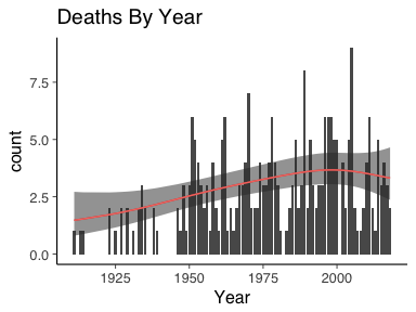
Here we can see that the function of the rate was increasing in time until about the 1990’s where is peaked off and appears to be decreasing. There is a much tighter bound on the rate too. But is it an improvement on the baseline model? For this we can use Bayesian leave one-out-cross validation and posterior p-values.
For ease, we first re-do our baseline model but with rstanarm package
baselineModel <- stan_glm(TotalDeaths~1, data=deathYearsModel, family="poisson")
LOO
Leave-one-out Cross Validation (LOOCV) is a method of model checking. By calculating the likelihood for each data point, one can check how sensitive the overall fit of the model is based on removing single points at a time. Using the loo R package we can easily calculate the LOOCV for both our models.
baseLOO <- loo(baselineModel)
gamLOO <- loo(basicGam)
compare_models(gamLOO, baseLOO)
##
## Model comparison:
## (negative 'elpd_diff' favors 1st model, positive favors 2nd)
##
## elpd_diff        se
##      -5.7       2.7
The negative value of elpd_diff shows that the first model is preferable. Therefore we can conclude that the GAM model is an improvement on the baseline model.
Posterior Predictive Checks
Another way of checking model fit is to simulate data from the inferred parameters. Using the bayesplot package we can pass our rstanarm models out get simulated data for each parameter sample.
basePPC <- posterior_predict(baselineModel)
gamPPC <- posterior_predict(basicGam)
Using what is known as a rootogram, we can then overlay the simulated data over the true data.
ppc_rootogram(deathYearsModel$TotalDeaths, basePPC, style=c("suspended")) + ggtitle("Baseline Rootogram")
ppc_rootogram(deathYearsModel$TotalDeaths, gamPPC, style=c("suspended")) + ggtitle("Gam Rootogram")
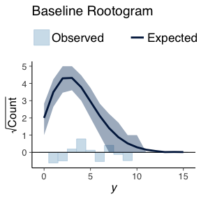
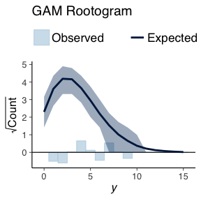
The bars indicate how the how different the true data distribution is compared to the simulated data. A good model would not have any large bars in either direction.
Both the baseline model and the GAM model are of the same types we do not expected to see much difference in the generated data. The comparison between both models using simulated data shows this. There is no real difference in the simulated data.
We now move onto comparing how the models behave over time. I.e. what they predicted for each year and what actually was observed. For each of the posterior predictions, we calculate a posterior mean and credible interval.
data.frame(Mean=colMeans(gamPPC), t(apply(gamPPC, 2, quantile, probs=c(0.05, 0.95))), Time=deathYearsModel$Year) -> gamPPC_quant

data.frame(Mean=colMeans(basePPC), t(apply(basePPC, 2, quantile, probs=c(0.05, 0.95))), Time=deathYearsModel$Year) -> basePPC_quant
We then plot these results with error bars and the true data.
ggplot() +
  geom_linerange(data=gamPPC_quant, aes(x=Time, ymin=X5., ymax=X95.)) +
  geom_point(data=gamPPC_quant, aes(x=Time, y=Mean)) +
  geom_point(data=deathYearsModel, aes(y=TotalDeaths, x=Year), colour="red") +
  ggtitle("GAM Predictions")

ggplot() +
  geom_linerange(data=basePPC_quant, aes(x=Time, ymin=X5., ymax=X95.)) +
  geom_point(data=basePPC_quant, aes(x=Time, y=Mean)) +
  geom_point(data=deathYearsModel, aes(y=TotalDeaths, x=Year), colour="red") +
  ggtitle("Baseline Predictions")
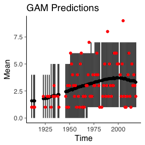
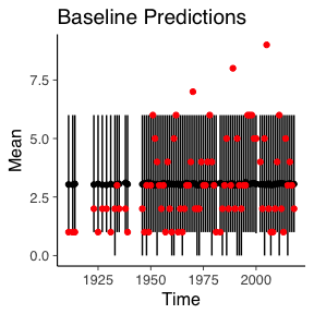
Naturally, the simulated data from the baseline remains constant over time and the GAM model has a slight increase overtime. But the change in time for the GAM model still isn’t enough to account for the three worst years of the Isle of Man TT.
Forecasts
What about the next 10 years, how do we expect the number of deaths to change?
For this we need to create a dummy dataframe with the years after 2018. We also add an indicator variable to show whether that year is out of sample.
predX <- data.frame(YearDiff=113 + 1:13, OOS=0)
predX %>% mutate(OOS=if_else(YearDiff > 118, 1, 0), Year=year(dmy("01-01-1900")+years(YearDiff))) -> predX
With the new dataframe we can use the posterior_predict function and calculate our posterior means and credible intervals to arrive at some estimates.
outofsamplePreds <- posterior_predict(basicGam, newdata = predX)

data.frame(Mean=colMeans(outofsamplePreds), t(apply(outofsamplePreds, 2, quantile, probs=c(0.05, 0.95))), Time=predX$Year, OOS=predX$OOS) -> oosPPC_quant
Plotting theses estimates and colouring the out of sample predictions is more of the same code as previously used.
ggplot() +
  geom_linerange(data=oosPPC_quant, aes(x=Time, ymin=X5., ymax=X95.)) +
  geom_point(data=oosPPC_quant, aes(x=Time, y=Mean, colour=as.factor(OOS))) +
  guides(colour=FALSE) +
  ggtitle("GAM Future Predictions")
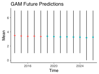
The blue dots indicate the future number of deaths with 95% credible intervals. As we can see, very little change in the future number of deaths. Although 0 deaths is within the credible interval from 2024 onwards so fingers crossed that this trend continues and the number of deaths ends up decreasing.
Conclusion
In this blog post I have shown you how to download a data-table from Wikipedia, clean it up using some reg-ex and do some basic plots. I then proceeded to model the total number of deaths per year using a Bayesian GLM and GAM model. The GAM model was a better fitting model which we then used to predict the future number of deaths. For which the overall outlook appears to be constant. I hope you’ve learnt something from reading the blog post, if you’ve any questions or improvements please leave a comment below or contact me on Twitter!.