Goodreads Analysis
Goodreads is a personalised book recording website. After you read a book you can rate it and see what everyone else thought about the book. In this series of blog posts I will be analysing this data to see what I can learn about my reading habits.
require(readr)
require(ggplot2)
require(knitr)
require(dplyr)
require(lubridate)

require(ggthemes)
theme_set(theme_fivethirtyeight() +
  theme(axis.title = element_text(),
        plot.background = element_rect(fill="#fdfdfd"),
        panel.background = element_rect(fill="#fdfdfd")))
You can follow along by downloading your own Goodreads data from https://www.goodreads.com/review/import .
First we load in the data using the csv reader function in readr.
rawData <- read_csv("Data/goodreads_library_export.csv")
names(rawData) <- make.names(names(rawData))
The data ranges from 2015-07-13 to 2019-04-01 and consists of 96 books.
ggplot(rawData, aes(x=My.Rating)) +
  geom_bar()
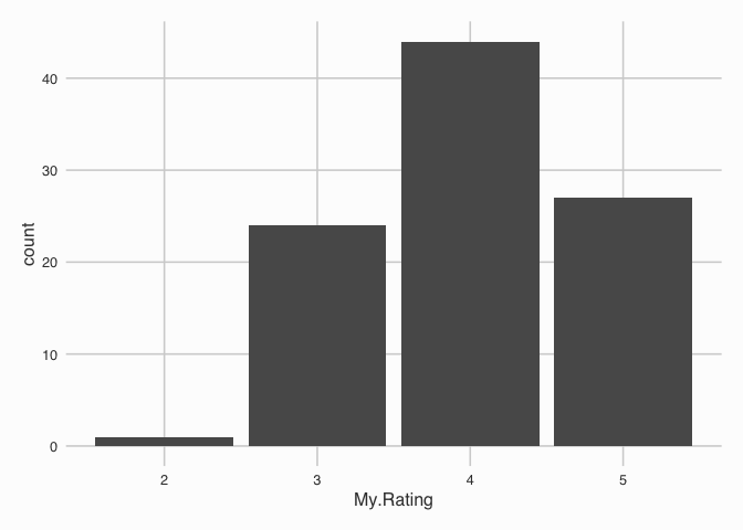
Here we can see that I’m quite the generous rater, throwing 4’s and 5’s with abandon. Although, I tend to only rate books that I’ve finished. If a book was going to get 1 star I might aswell abandon it. Life’s too short to be reading bad books.
In the data, they also provide you with the crowd ranking of the book. I.e. what everyone else have ranked the book.
ggplot(rawData, aes(x=Average.Rating)) +
  geom_histogram(binwidth = 0.5)
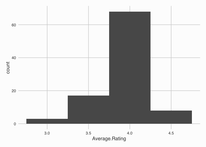
The average ratings of the book are a bit more compressed with a range of 2.87, 4.46.
My Best and Worst Books (according to everyone else)
rawData %>%
  arrange(desc(Average.Rating)) %>%
  select(Title, Author, Average.Rating) %>%
  head(5) %>%
  kable
| Title | Author | Average.Rating |
|---|---|---|
| Shoe Dog: A Memoir by the Creator of NIKE | Phil Knight | 4.46 |
| The Book Thief | Markus Zusak | 4.37 |
| All Out War: The Full Story of How Brexit Sank Britain’s Political Class | Tim Shipman | 4.35 |
| The Fellowship of the Ring (The Lord of the Rings, #1) | J.R.R. Tolkien | 4.35 |
| The Pillars of the Earth (Kingsbridge, #1) | Ken Follett | 4.31 |
The highest ranked books in my data are unsurprising. I think all of them will be familiar to the reader of this post.
rawData %>%
  arrange(Average.Rating) %>%
  select(Title, Author, Average.Rating) %>%
  head(5) %>%
  kable
| Title | Author | Average.Rating |
|---|---|---|
| Keynes’s Way to Wealth: Timeless Investment Lessons from The Great Economist | John F. Wasik | 2.87 |
| Opening Credit: A practitioner’s guide to credit investment | Justin McGowan | 3.00 |
| Disraeli: A Personal History | Christopher Hibbert | 3.10 |
| Avoid Boring People: And Other Lessons from a Life in Science | James D. Watson | 3.26 |
| The Noble Hustle: Poker, Beef Jerky, and Death | Colson Whitehead | 3.31 |
The lowest average rating book are two fairly academic books (Keynes and Credit). The Disraeli book isn’t that thrilling of a read either, lots of extracts from letters. Avoid Boring People is the biography of DNA discoverer James Watson (he’s not the one with the controversy section on Wikipedia thankfully). Finally, the Noble Hustle was £1 from Waterstones, which makes sense now looking at the rating.
Do I agree with the crowd?
If we plot My.Rating against the Average.Rating we will be able to
see if there is any correlation between the two. A positive correlation
would indicate that my rating agrees with the crowd rating, a negative
correlation would be contrarian.
ggplot(rawData, aes(x=My.Rating, y=Average.Rating)) +
  geom_jitter(width=0.1, height=0) +
  geom_smooth(method="lm", se=FALSE)
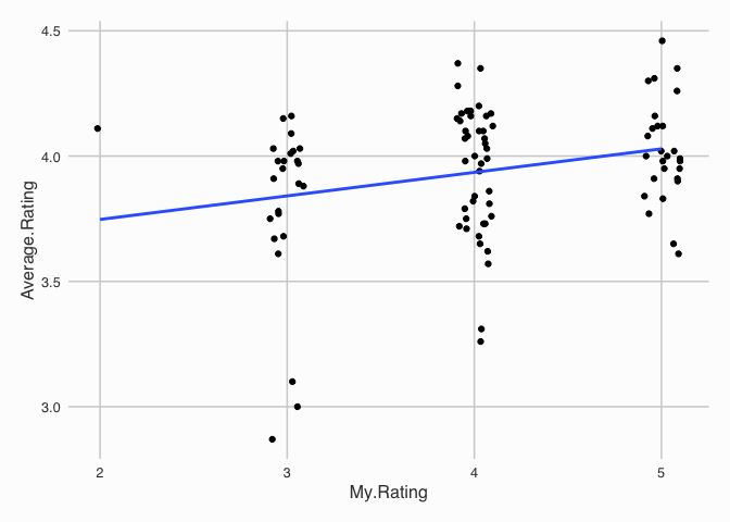
This plot shows that the best fitting straight line is slightly positive, which suggests I agree with the crowd. This is not a massively thorough statistical investigation, but, just something to start with.
Page Length and Rating
I previously stated that I don’t rate bad books. This would suggest that books with more pages are likely to get a better rating because I wouldn’t stick around with a bad book.
ggplot(rawData, aes(x=Number.of.Pages, y=My.Rating)) +
  geom_jitter(width=0, height=0.1) +
  geom_smooth(method="lm", se = FALSE)

ggplot(rawData, aes(x=log(Number.of.Pages), y=My.Rating)) +
  geom_jitter(width=0, height=0.1) +
  geom_smooth(method="lm", se = FALSE)
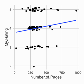
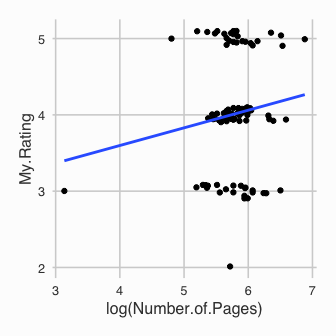
Another slight trend positive trend for both Number.of.Pages and
log(Number.of.Pages). This does suggest then that I am more likely to
rate a longer book higher.
A Slight Problem
When recording the data, 71% of it was added in bulk. Therefore, the rating I’ve provided is on the memory of the book, rather than straight away after finishing it.
rawData %>% mutate(MemoryRating = is.na(Date.Read)) -> rawData

ggplot(rawData, aes(x=My.Rating)) +
  geom_bar() +
  facet_wrap(~MemoryRating) +
  ggtitle("Memory Rating?")
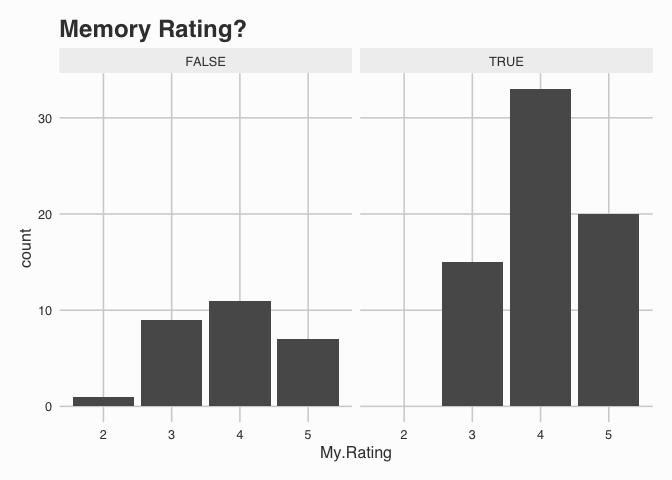
This graph shows how that my ratings from memory are more unbalanced. This is an interesting feature of the data and suggests that perhaps my default rating of a book is 4 stars.
Conclusion
So far we have explored the data and plotted some interesting graphs. My ratings seem to agree with the crowd and we’ve also shown that I’m more likely to give a book I remember 4 stars over one I’ve just read. Now none of these statements are rigorous in a statistical sense. Its just a case of plotting data and getting a feel for where the trends are. Actually formally testing these hypothesis is work for another blog post.