Palmer Penguins and an Introduction to Dirichlet Processes
Dirichlet processes are complicated but this blog post will be simple. I will show you what a Dirichlet process looks like before it sees the data and then how it looks after it has been fitted on the data.
I spent most of my first year of my PhD getting my head around Dirichlet
processes and how they can be used as a Bayesian nonparametric
model. Eventually, the dirichletprocess package was born and its aim is to
provide a simple way of using Dirichlet processes in your everyday
statistical analysis.
When people think of Bayesian statistics the common thought process is
\[\text{prior} \rightarrow \text{data} \rightarrow \text{posterior} \rightarrow \text{parameter estimate}\]and you then usually see graphs like this:
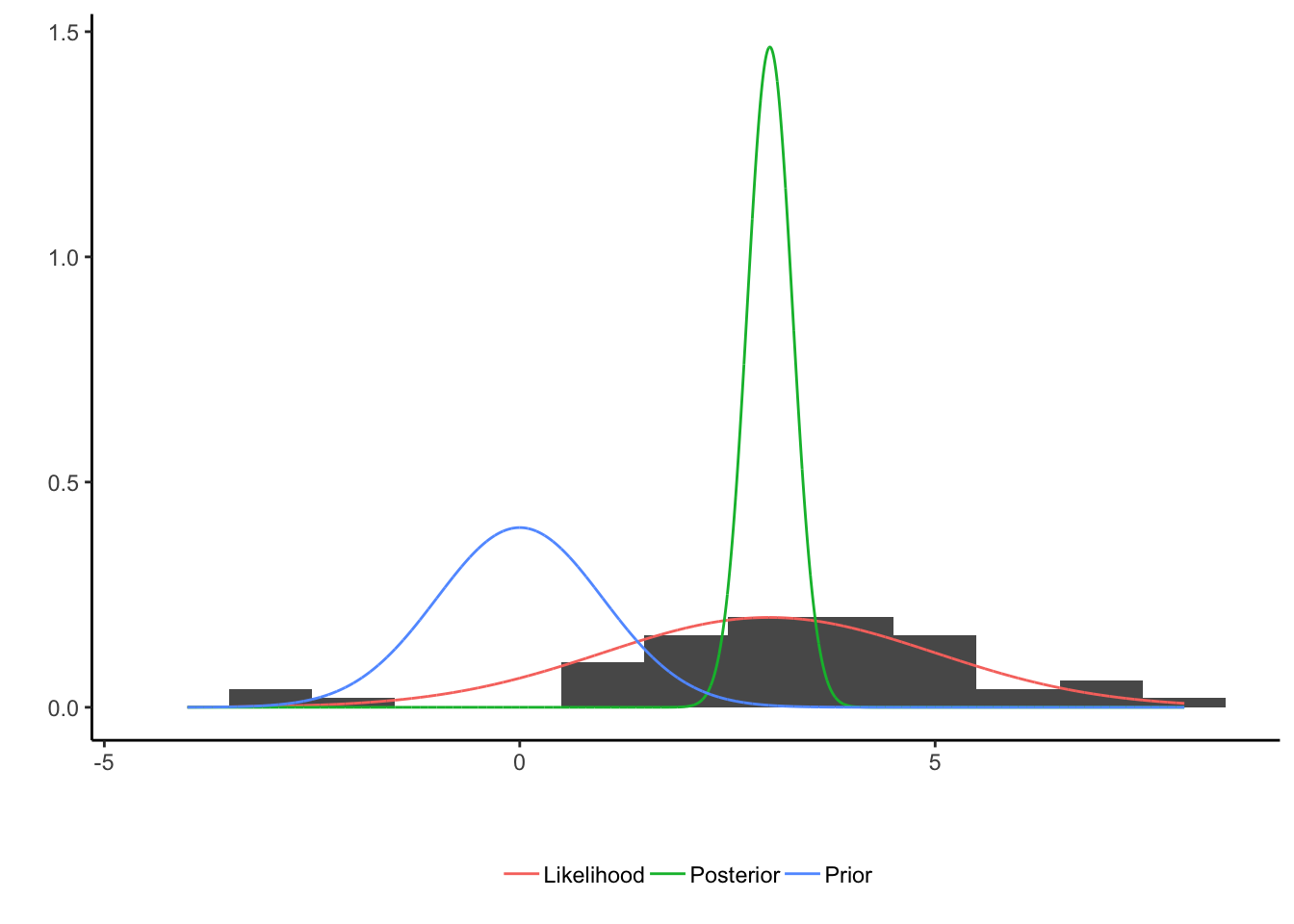
which shows how the three different components can be visualised. The parameter estimation in this case could be obtained by taking the mean of the posterior distribution to give a final value, which would be a number.
What I want this blog post to do is visualise the above workflow/thought process but for Dirichlet process. So showing
- What a Dirichlet process prior looks like.
- How the Dirichlet process takes the data to produce a posterior distribution.
- Plus, how this extends to multiple dimensions.
I’ll be using the Palmers Penguins dataset to show case these methods
which can be obtained easily by downloading the same named package
from CRAN. And of course, download the dev version of my package dirichletprocess too.
install.packages("palmerpenguinds")
require(palmerpenguins)
devtools::install_github("dm13450/dirichletprocess")
require(dirichletprocess)
In this dataset there are three different species of penguin each with different physical measurements. There is some nice clustering in the data which makes it perfect for some multivariate modelling. But first we will start with one dimension.
One Dimension Dirichlet Processes
What does a one dimension Dirichlet process represent? Simply a density estimation of the variable we are interested in. So for example, the body masses of the Penguins in this dataset looks like this:
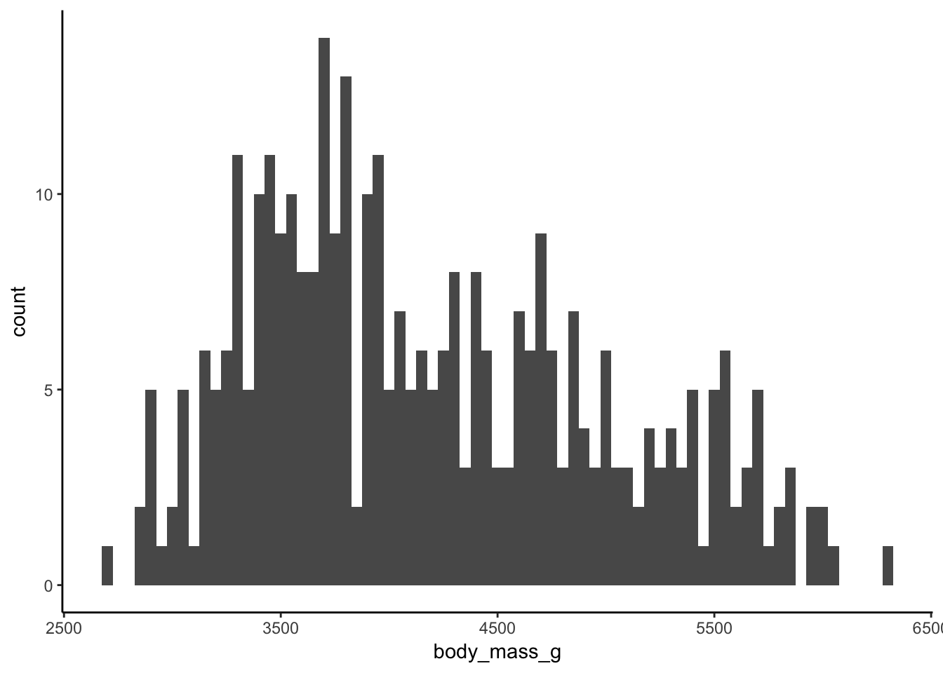
we can use a Dirichlet process to come up with a Bayesian estimation of the density of the body masses. It works by using as many normal distributions as needed to follow the shape of the histogram of the data. The Dirichlet process is fitted using the default prior distribution after having rescaled the input data.
dp <- DirichletProcessGaussian(scale(allData$body_mass_g))
dp <- Fit(dp, 1000, progressBar = F)
plot(dp, data_method="hist")
This shows how the distribution is multimodal. But what about our workflow above? How does the prior distribution look and how about the posterior?
In this case I draw 100 times from the prior and posterior distribution.
xGrid <- seq(-3, 3, by=0.1)
res <- vector("list", 100)
for(i in 1:100){

  priorF <- dirichletprocess:::PriorFunction(dp)
  postF <- PosteriorFunction(dp)

  res[[i]] <- data.frame(x = xGrid, Posterior = postF(xGrid), Prior = priorF(xGrid), Iter = i)

}
allRes <- bind_rows(res)

ggplot(allRes, aes(x=x, y=Posterior, group=Iter)) +
  geom_histogram(data=data.frame(x=dp$data), aes(x=x, y=..density..), inherit.aes = F, binwidth = 0.1) +
  geom_line() +
  xlab(element_blank()) +
  ylab(element_blank()) +
  ggtitle("Posterior Dirichlet Object Draws") -> post1D


ggplot(allRes, aes(x=x, y=Prior, group=Iter)) +
  geom_histogram(data=data.frame(x=dp$data), aes(x=x, y=..density..), inherit.aes = F, binwidth = 0.1) +
  geom_line() +
  xlab(element_blank()) +
  ylab(element_blank()) +
  ggtitle("Prior Dirichlet Object Draws") -> prior1D

prior1D + post1D
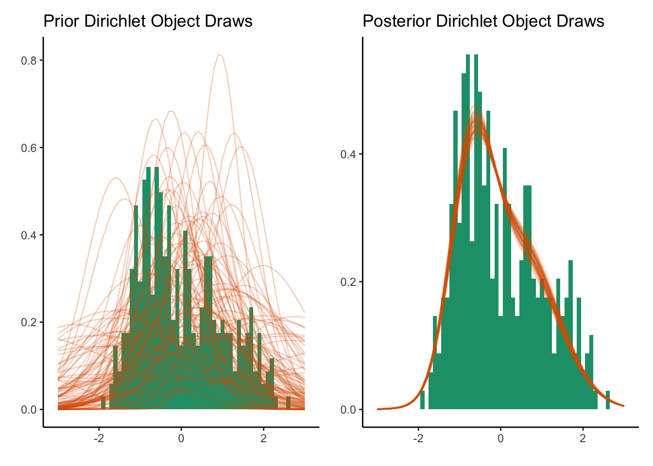
The prior distributions are essentially random guesses of a distribution but once we observe the data, we can shape the density guess into something that resembles the data. In our illustration at the top, the width of the posterior distribution represents the uncertainty in the estimate, likewise in the Dirichlet process, the width that the curves trace out represent the uncertainty.
A Two Dimensional Dirichlet Process
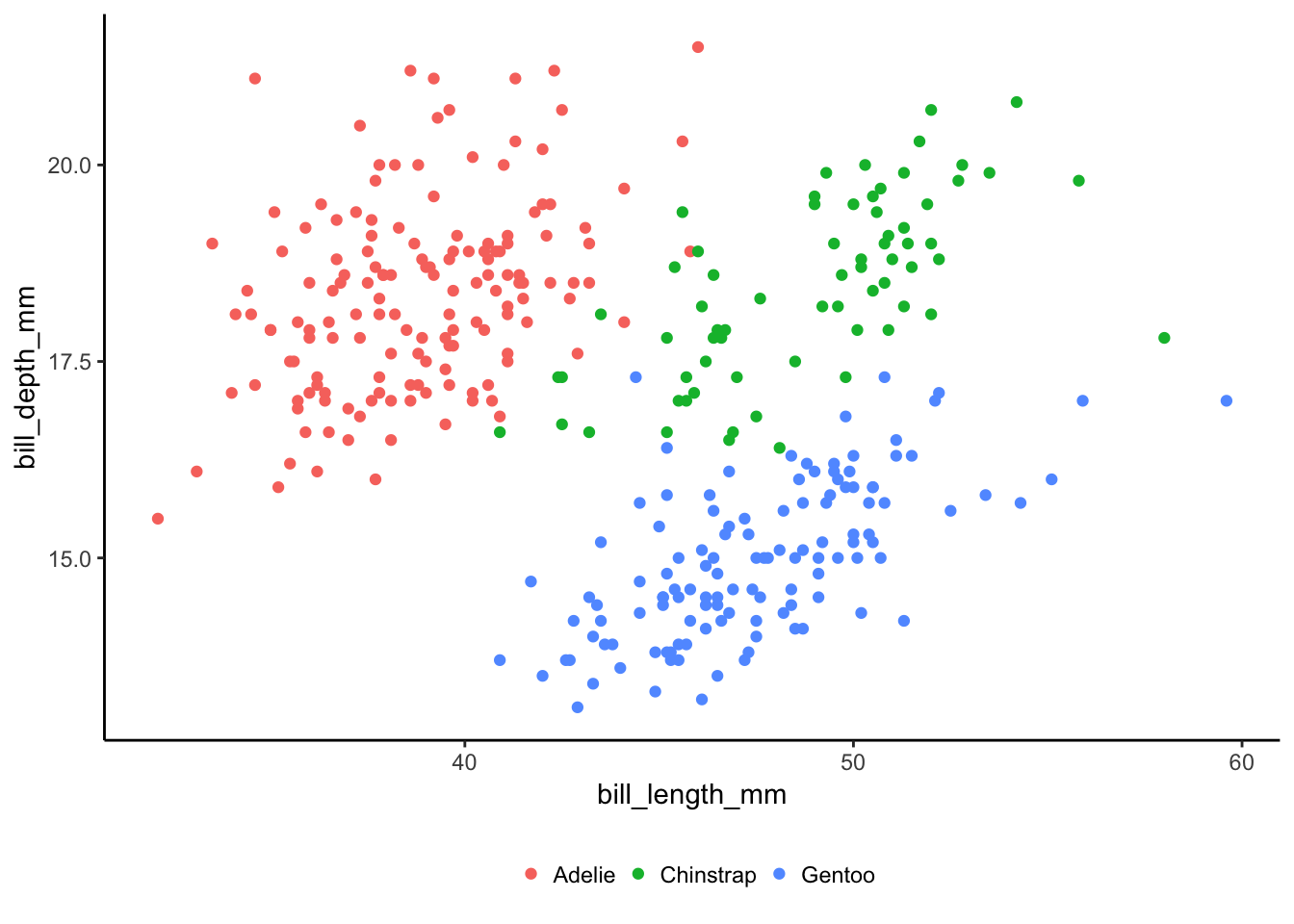
Let us take it up a notch and see what happens in two dimensions. We
want to model the bill length and bill depth of the penguins. This
requires a DirichletProcessMvnormal object that is fitted for 2500
iterations, with the default prior distribution and the data has been
scaled to have zero mean and unit variance.
allData %>%
  select(bill_length_mm, bill_depth_mm) %>%
  scale -> trainData

dp <- DirichletProcessMvnormal(trainData)
dp <- Fit(dp, 2500)
plot(dp)
The default plotting function from the dirichletprocess package
shows the clusters that mimic what we saw in the raw data above, so
the Dirichlet process model has found some sort of structure in the
data. Now like the 1D example we want to show the prior and posterior
distributions.
gridVals <- expand.grid(seq(-3, 3, by=0.05),
                        seq(-3, 3, by=0.05))

pf <- PosteriorFunction(dp)

prob <- pf(gridVals)

plotFrame <- data.frame(gridVals, Probability = prob)

ggplot(plotFrame, aes(x=Var1, y=Var2, colour=Probability, fill=Probability)) +
  geom_tile() +
  ggtitle("Posterior Values") +
  xlab("Bill Length") +
  ylab("Bill Depth") +
  theme(legend.position = "none") +
  scale_fill_distiller() +
  scale_color_distiller()
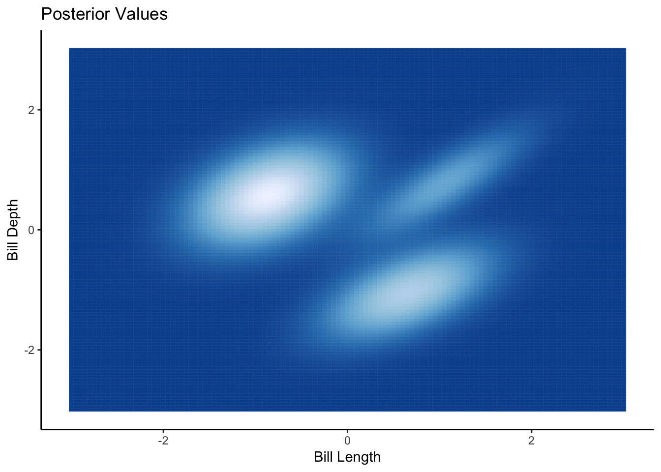
From the plot we can see the three clusters in the heatmap of the posterior density, which corresponds to the default plotting colouring of the species too.
priorFrame <- vector("list", 4)
for(i in 1:4){
  priorF <- PriorFunction(dp)
  priorFrame[[i]] <- data.frame(gridVals, Probability = priorF(gridVals), Iter = i)
}
priorFrameAll <- bind_rows(priorFrame)

ggplot(priorFrameAll, aes(x=Var1, y=Var2, colour=Probability, fill = Probability)) +
  geom_tile() +
  facet_wrap(~Iter) +
  ggtitle("Prior Values") +
  xlab("Bill Length") +
  ylab("Bill Depth") +
  theme(legend.position = "none") +
  scale_fill_distiller() +
  scale_color_distiller()
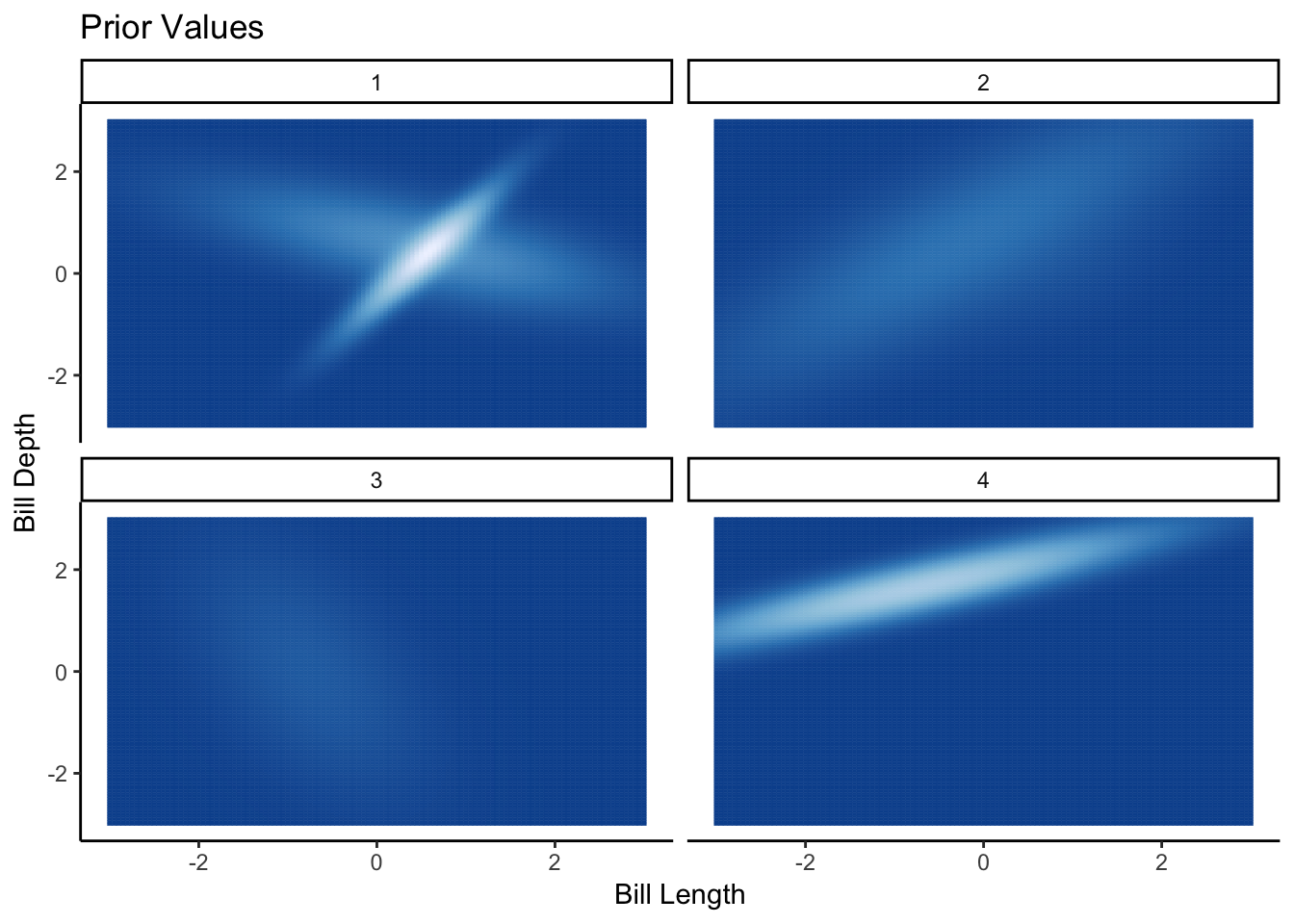
Here from the prior draws we can see the variety of different distributions that could fit the data. Its a bit harder to visualise the draws, this time each panel is a separate draw rather than layering them onto of each other like in the 1D case. But you can still see the randomness in the prior distribution. More importantly, each prior draw is a (bad) valid guess at what the data looks like, so we know that the prior distribution is sensibly set up.
Sometimes before we get stuck into a new model or technique it helps to visualise what it actually happening and hopefully this blog post should help you visualise what a Dirichlet process is doing, as in what the prior distribution looks like and then what the posterior distribution it trying to achieve. If your prior doesn’t cover the area of your data, then your posterior is going to struggle. Using these visualisations you can make sure the model is doing what you expect and can help you get a handle on your problem.