QuestDB Part 2 - High Frequency Finance (again!)
Last time I showed you how to set up a producer/consumer model to build a database of BTCUSD trades using the CoinbasePro WebSocket feed. Now I’ll show you how you can connect to the same database to pull out the data, use some specific timeseries database queries and hopefully show where this type of database is useful by improving some of my old calculations. You should read one of my older blog posts on high frequency finance (here) as I’m going to repeat some of the calculations using more data this time.
Enjoy these types of posts? Then sign up for my newsletter.
I ingested just over 24 hours worth of data over the 24th and 25th of July. Completely missed the massive rally though, which is just my luck, that would have been interesting to look at! Oh well.
Julia can connect to the database of the LibPQ.jl package and execute queries using all their functions. This is very handy as we don’t have to worry about database drivers or connection methods, we can just connect and go.
using LibPQ
using DataFrames, DataFramesMeta
using Plots
using Statistics, StatsBase
using CategoricalArrays
Default connection details to the database are used to connect to the database.
conn = LibPQ.Connection("""
             dbname=qdb
             host=127.0.0.1
             password=quest
             port=8812
             user=admin""")
PostgreSQL connection (CONNECTION_OK) with parameters:
  user = admin
  password = **
  dbname = qdb
  host = 127.0.0.1
  port = 8812
  client_encoding = UTF8
  options = -c DateStyle=ISO,YMD -c IntervalStyle=iso_8601 -c TimeZone=UTC
  application_name = LibPQ.jl
  sslmode = prefer
  sslcompression = 0
  gssencmode = disable
  krbsrvname = postgres
  target_session_attrs = any
Very easy, Julia just thinks that it is a Postgres database. We can quickly move onto working with the data.
I start with simply getting all the trades out of the database.
@time trades = execute(conn, "SELECT * FROM coinbase_trades") |> DataFrame
dropmissing!(trades);
nrow(trades)
  4.828067 seconds (9.25 M allocations: 335.378 MiB, 1.64% gc time)

210217
It took about 5 seconds to pull 210 thousand rows into the notebook.
plot(trades.timestamp, trades.price, label=:none, fmt=:png)
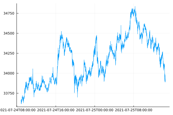
Like I said in my last post, I missed the sudden rally on Sunday 25th which was a bit unlucky. Side note, Plots.jl does struggle with formatting the x axis with a timeseries plot.
Now to move onto updating my previous graphs with this new dataset.
Order Sign Correlation
The correlation between buys and sells follows a power law. Last time, I only had 1000 trades to work after pulling them using the REST API. Now I’ve got 200x more, which should improve the uncertainty around the previous values.
ac = autocor(trades.side)
acplot = plot(1:length(ac), ac, seriestype=:scatter, label = :none, xlab="Lag", ylab = "Correlation")
aclogplot = plot(log.(1:length(ac)), log.(ac), seriestype=:scatter, label=:none, xlab= "log(Lag)", ylab="log(Correlation)")
plot(acplot, aclogplot, fmt=:png)
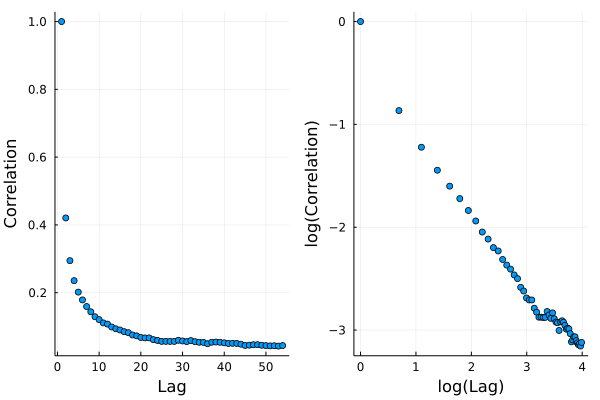
In the log-log plot we can see a nice straight line which we fit a linear model on.
using GLM

sideModel = lm(@formula(log(AC) ~ log(Lag)), DataFrame(AC=ac, Lag=1:length(ac)))
StatsModels.TableRegressionModel{LinearModel{GLM.LmResp{Vector{Float64}}, GLM.DensePredChol{Float64, LinearAlgebra.CholeskyPivoted{Float64, Matrix{Float64}}}}, Matrix{Float64}}

:(log(AC)) ~ 1 + :(log(Lag))

Coefficients:
──────────────────────────────────────────────────────────────────────────
                 Coef.  Std. Error       t  Pr(>|t|)  Lower 95%  Upper 95%
──────────────────────────────────────────────────────────────────────────
(Intercept)  -0.439012   0.049596    -8.85    <1e-11  -0.538534  -0.339491
log(Lag)     -0.70571    0.0156489  -45.10    <1e-42  -0.737112  -0.674308
──────────────────────────────────────────────────────────────────────────
This time we’ve got a \(\gamma\) value of 0.7 with more certainty.
plot(log.(1:length(ac)), log.(ac), seriestype=:scatter, label=:none)
plot!(log.(1:length(ac)), coef(sideModel)[1] .+ coef(sideModel)[2] .* log.(1:length(ac)),
      label="Model", xlab= "log(Lag)", ylab="log(Correlation)", fmt=:png)
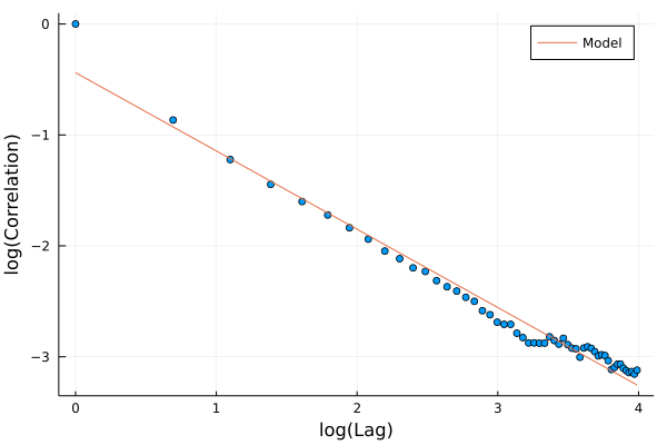
Lines up nicely with the data and better than the previous attempt with just 1000 trades. \(\gamma\) is less than one which means it is a ‘long memory’ process, so trades in the past effect trades in the future for a long time. This is usually explained as the effect of people breaking up large trades into slices and executing them bit by bit.
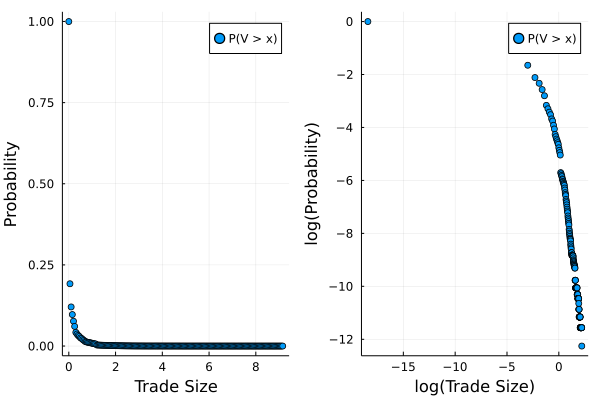
Order Size Distribution
Again, the size of each trade follows a power law distribution too. We use a slightly different method to estimate the exponent and last time with just 1000 trades we struggled to get a stable value. Now, with so much more data we can have another crack.
uSizes = minimum(trades.size):0.05:maximum(trades.size)

empF = ecdf(trades.size)

tradesSizePlot = plot((uSizes), (1 .- empF(uSizes)), seriestype=:scatter, label="P(V > x)", xlabel="Trade Size", ylabel="Probability")
tradesSizeLogPlot = plot(log.(uSizes), log.(1 .- empF(uSizes)), seriestype=:scatter, label="P(V > x)", xlabel = "log(Trade Size)", ylabel="log(Probability)")

plot(tradesSizePlot, tradesSizeLogPlot, fmt=:png)
Using the same Hill estimator as last time
function hill_estimator(sizes_sort, k)
    #sizes_sort = sort(sizes)
    N = length(sizes_sort)
    res = log.(sizes_sort[(N-k+1):N] / sizes_sort[N-k])
    k*(1/sum(res))
end
sizes = trades.size
sizes_sort = sort(sizes)
bds = 2:100:(length(sizes)-1000-1)


alphak = [hill_estimator(sizes_sort, k) for k in bds]
plot(bds, alphak, xlabel="k", ylabel="Alpha", label=:none, fmt=:png)
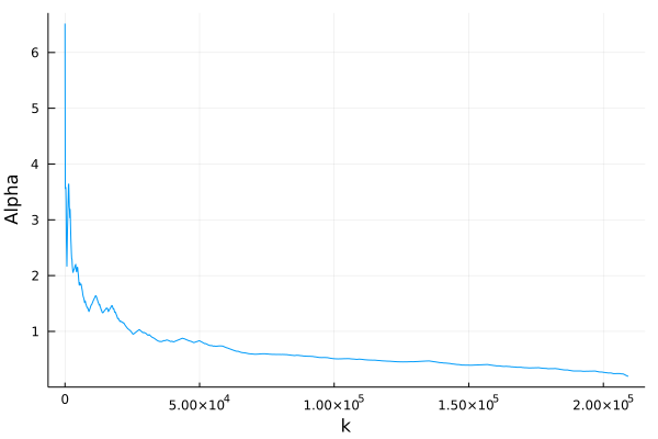
Still hard to make a judgement as to whether it is converging to a value or not. It is always appears to be decreasing no mate the sample size. Maybe I still need more data or maybe need a better understanding of the Hill estimator!
Market Impact
I’ve not been using QuestDB to its full potential and repeating all my previous graphs hasn’t fully exploited the available features. One of those features is the ability to group by the timestamp across a bucket size (1 second, 5 minutes etc.) and aggregate the data. We will use that to try and come up with a better model of market impact than I had in my previous post.
We aggregate the trades into 1 minute buckets and calculate the total volume traded, the total signed volume (sell trades count as negative), the last price and also the number of trades in each bucket.
@time marketimpact = execute(conn,
    "SELECT timestamp, sum(size) as TotalVolume,
            sum(size*side) as SignedVolume,
            last(price) as Close,
            count(*) as NTrades
     FROM coinbase_trades
    SAMPLE by 1m") |> DataFrame
dropmissing!(marketimpact)
marketimpact[1:3, :]
0.223987 seconds (167.29 k allocations: 8.708 MiB, 56.20% compilation time)
| timestamp | TotalVolume | SignedVolume | Close | NTrades | |
|---|---|---|---|---|---|
| DateTim… | Float64 | Float64 | Float64 | Int64 | |
| 1 | 2021-07-24T08:50:34.365 | 1.75836 | -0.331599 | 33649.0 | 52 |
| 2 | 2021-07-24T08:51:34.365 | 4.18169 | -3.01704 | 33625.2 | 67 |
| 3 | 2021-07-24T08:52:34.365 | 0.572115 | -0.325788 | 33620.1 | 46 |
This took less than a second and is a really easy line of code to write.
Now for the market impact calculation, we calculated the return bucket to bucket and normalise the signed volume by the total volume traded to give a value of between -1 and 1. This is taken from https://arxiv.org/pdf/1206.0682.pdf and equation 26.
marketimpact[!, :returns] .= 1e4.*[NaN; diff(log.(marketimpact.Close))]
marketimpact[!, :NormVolume] .= marketimpact[!, :SignedVolume] ./ marketimpact[!, :TotalVolume]

miModel = lm(@formula(returns ~ NormVolume + 0), marketimpact[2:end, :])
StatsModels.TableRegressionModel{LinearModel{GLM.LmResp{Vector{Float64}}, GLM.DensePredChol{Float64, LinearAlgebra.CholeskyPivoted{Float64, Matrix{Float64}}}}, Matrix{Float64}}

returns ~ 0 + NormVolume

Coefficients:
──────────────────────────────────────────────────────────────────────
              Coef.  Std. Error      t  Pr(>|t|)  Lower 95%  Upper 95%
──────────────────────────────────────────────────────────────────────
NormVolume  4.55478    0.290869  15.66    <1e-51     3.9843    5.12526
──────────────────────────────────────────────────────────────────────
Here we can see that there is a positive coefficient, \(\theta\) in the paper, as expected, and we can interpret this at how much the price moves after buying or selling. Specifically, in these minute buckets, those that contained only buy trades moved the market up by 4.5bps and the same for sells in the opposite direction.
plot(marketimpact.NormVolume, marketimpact.returns, seriestype=:scatter, label=:none,
     xlab="Normalised Volume", ylab="Market Impact (log(bps))")
plot!(-1:0.1:1, coef(miModel)[1] .* collect(-1:0.1:1), label="Model", linewidth=3, legend=:topleft, fmt=:png)
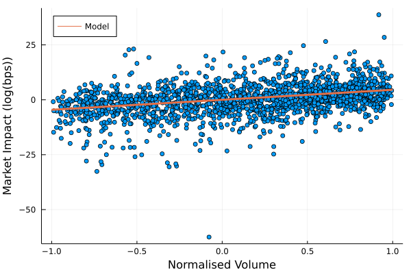
You can see how the model lines of with the data and there is a very slight trend that is picked. So overall, a better, if still very simple model of market impact.
Trades with Top of Book
Now I’ve saved down the best bid and offer using the same process as Part 1 of this series. Over the same time period, the best bid and offer data has 17 million rows. So quite a bit more.
I use this best bid-offer data to do an ASOF join. This takes two tables with timestamps and joins them such that the timestamps align or the previous observation is used. In our case, we can take the trades, join it with the best bid and best offer table to get where the mid price was at the time of the trade.
@time trades2 = execute(conn,
    "SELECT *
     FROM coinbase_trades
    ASOF JOIN coinbase_bbo") |> DataFrame
dropmissing!(trades2);
9.745210 seconds (18.49 M allocations: 671.544 MiB, 1.84% gc time)
This took 11 seconds, but was all done in the database, so no issue
with regards to blowing out the memory after pulling it into your
Julia session. Doing a normal join in Julia would only match
timestamps exactly, whereas we want the last observed bid/offer price
at least making the ASOF function very useful.
We now go through and calculate a mid price, how far the traded price was from the mid price and also add an indicator for what quantile the trade size landed in. We then group by this quantile indicator and calculate the average trade size and average distance from the mid price.
trades2[!, :Mid] .= (trades2.bid .+ trades2.ask)./2;
trades2[!, :Cost] .= 1e4 .* trades2.side .* ((trades2.price .- trades2.Mid) ./ (trades2.Mid))
trades2[!, :SizeBucket] .= cut(trades2[!, :size], [quantile(trades2[!, :size], 0:0.1:1); Inf])
gdata = groupby(@where(trades2, :Cost .> 0), :SizeBucket)
costData = @combine(gdata, MeanSize = mean(:size), MeanCost = mean(:Cost))

logCostPlot = plot(log.(costData.MeanSize),
                   log.(costData.MeanCost), seriestype=:scatter,
                   label=:none,
                   xlab="log(Size)",
                   ylab="log(Cost)", fmt=:png)
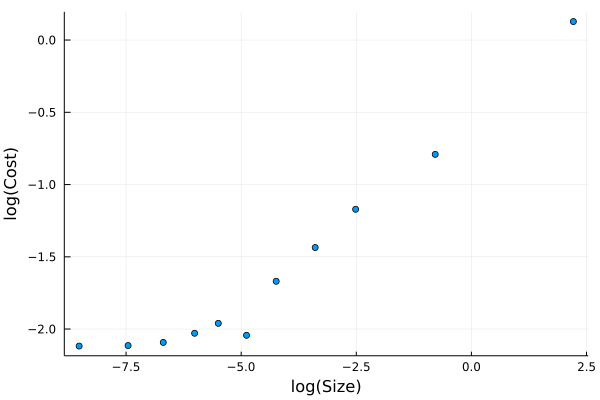
Unsurprisingly, we can see that larger trades are further away from the mid price when they execute. This is because they are eating through the posted liquidity.
This is very similar to my https://cryptoliquiditymetrics.com/ sweep the book graph which is estimating the cost of eating liquidity. This graph above is showing the actual cost of eating liquidity for real trades that have happened on Coinbase.
We can fit a model to this plot and it is commonly referred to as the square root law of market impact. We ignore the smaller trade sizes, as they aren’t following the nice linear log-log plot.
costModel = lm(@formula(log(MeanCost) ~ log(MeanSize)),
                     @where(costData, :MeanSize .> exp(-7)))
StatsModels.TableRegressionModel{LinearModel{GLM.LmResp{Vector{Float64}}, GLM.DensePredChol{Float64, LinearAlgebra.CholeskyPivoted{Float64, Matrix{Float64}}}}, Matrix{Float64}}

:(log(MeanCost)) ~ 1 + :(log(MeanSize))

Coefficients:
───────────────────────────────────────────────────────────────────────────
                   Coef.  Std. Error      t  Pr(>|t|)  Lower 95%  Upper 95%
───────────────────────────────────────────────────────────────────────────
(Intercept)    -0.534863   0.0683721  -7.82    0.0001  -0.696537  -0.373189
log(MeanSize)   0.259424   0.0154468  16.79    <1e-06   0.222898   0.29595
───────────────────────────────────────────────────────────────────────────
The \(\gamma\) value of 0.25 is pretty low compared to other assets, which we would expect to be around 0.5. But we haven’t included the usual volatility calculation which is in front of the volume component.
plot(log.(costData.MeanSize),
     log.(costData.MeanCost), seriestype=:scatter,
     label=:none,
     xlab="log(Size)",
     ylab="log(Cost)")
plot!(-8:0.1:3, coef(costModel)[1] .+ coef(costModel)[2] .* (-8:0.1:3),
      label="Model", legend=:topleft, fmt=:png)
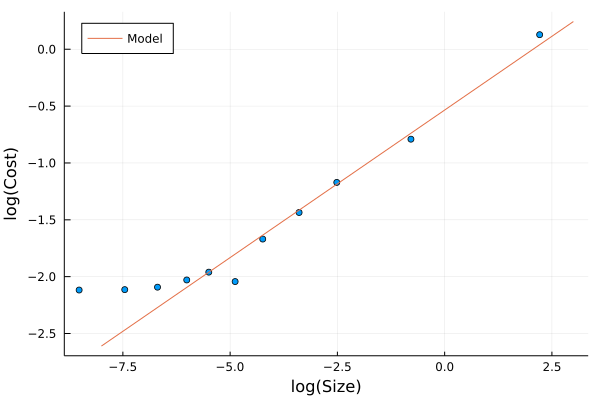
Apart from the small trades, the model lines up well with the increasing trade size.
Using this model you can start to estimate how much a strategy might cost to implement. At the end of the day, the outcome of your strategy is unknown, but your trading costs are known. If it costs you 1bp to enter and exit a trade (round trip) but you only think the price will change by 0.5bps, then your at a loss even if you were 100% right on the price direction!
Summary
QuestDB makes working with this data incredibly easy. Both aggregating
the data using SAMPLE BY and joining two datasets using AS
OF. Connecting to the database is a doddle using LibPQ.jl, so you
can get up and running without any issues. Very rare that these things
happen straight out the box.
Then by using this data I’ve ramped up the sample sizes and all my plots and models start to look better. Again, all free data and with hopefully, very minimal technical difficulty. As someone that usually finds themselves drowning in csvs QuestDB has shown how much more efficient things can be when you use a database.