Dipping My Toes into ETF Correlations
If like me you are a novice when it comes to looking at correlations this post will hopefully give you the tools and information needed to start thinking about correlations across the financial markets.
Enjoy these types of posts? Then sign up for my newsletter.
I’ve written plenty about volatility recently but have never explored correlations (or covariances). I read Rob Carver on Clustering and correlations and liked how he was separating different futures contracts into their respective categories based on their correlations and feeling inspired I decided to try and thorough replicate this using ETFs instead of futures.
Contents
- What is Correlation?
- Building a universe
- Calculating Correlation
- Calculating Rolling Correlation
- Clustering Correlation
- Using Correlation in Portfolio Construction
My environment is as follows:
knitr::opts_chunk$set(warning = FALSE, message = FALSE)
require(ggplot2)
require(tidyr)
require(readr)
require(dplyr)
require(alphavantager)
require(purrr)
require(knitr)
require(lubridate)
require(hrbrthemes)
theme_set(theme_ipsum())
extrafont::loadfonts()
require(wesanderson)
What is Correlation?
Let’s start with the basics. What exactly is correlation? Before we even start thinking about finance, let’s just try and generate some datasets that have different degrees of correlation. We have two values, X and Y and we want to see how they look with no, some and, high correlation.
To visualise this concept we simulate a 2D normal distribution and change the off-diagonal of the variance matrix to adjust the correlation between X and Y.
medCorMatrix <- diag(2)
medCorMatrix[1,2] <- 0.25
medCorMatrix[2,1] <- 0.25

mediumCorrelation <- MASS::mvrnorm(100, c(0,0), medCorMatrix) %>% as.data.frame
mediumCorrelation$Correlation <- "Medium"
Then by iterating through our different scenarios and values of the correlation we can get an idea of none, medium, high and anti correlation.
res <- list("data.frame", 4)

corVals <- c(0, 0.25, 0.95, -0.75)
corNames <- c("None", "Medium", "High", "Anti")

for(i in seq_along(corVals)){
  mtrx <- diag(2)
  mtrx[1,2] <- corVals[i]
  mtrx[2,1] <- corVals[i]
  sims <- MASS::mvrnorm(100, c(0,0), mtrx) %>% as.data.frame
  sims$Correlation <- corNames[i]
  res[[i]] <- sims
}
correlationSims <- bind_rows(res)
We can build a pretty picture of what these correlation values mean.
ggplot(correlationSims %>%
         rename(X=V1, Y=V2),
       aes(x=X, y=Y, color=Correlation)) +
  geom_point(alpha=0.5) +
  facet_wrap(~factor(Correlation, levels=c("None", "Medium", "High", "Anti"))) +
  geom_smooth(method="lm") +
  scale_color_manual(values = wes_palette("Darjeeling1")) +
  theme(legend.position="none")

On the far left, we have X and Y’s with no correlation between them, therefore they have dotted around all over the place, and the smoothing line is flat as there is no relationship. In medium correlation there is a bit of structure, we can see that lower X appears with lower values of Y, there is a bit of a slope in the smoothing line, but there is high uncertainty in the fit. For the high correlation, the structure is obvious, high values of X always correspond to high values of Y and there is a definite relationship between the two variables. For the anti-correlation, we can see high values of X lead to low values of Y, so they are inversely related.
So how does this translate to correlations in finance? If we have two assets and they both go up by the same amount on the same day, they are highly correlated. If one goes up and the other does nothing, then there is no correlation, with all the varying values in between. But what if one goes up and the other goes down? This is anti-correlation.
Building an ETF Universe
We’ve got an idea of what correlation means, now let’s pull together some financial data and do some calculations. As I said in the intro, we will be looking at correlations across ETFs as they can be separated into nice groups that represent different countries, sectors, assets and strategies.
You have SPY that tracks the S&P500, TLT that contains the US Treasury bonds, EWU represents the UK stock market. They can also represent commodities, USO and GLD will replicate (hopefully) the price action of oil and gold respectively. You can get even more esoteric, like MTUM which tracks stocks that have high momentum (their price is on an upward trend), or MNA, an ETF that buys companies that have been marked for a public takeover. By looking at the price return of each ETF like these we can observe the correlations and get an idea of the structure between different sectors, themes, and even countries. Do the UK and US both move up and down on the same days? Does a downturn in oil mean other sectors start experiencing positive returns?
To obtain this data we will be using alphavantager, the R interface to
the AlphaVantage website.
I have chosen a wide selection of ETFs and a table at the bottom ( The Full ETF Universe ) that classifies them and the link to their official description. I used https://etfdb.com/ to source the relevant information, making sure I chose the most popular ETF in each category.
get_data <- function(x){
  fn <- paste0("data/", x, ".csv")
  if(file.exists(fn)){
    dt <- read_csv(fn, show_col_types = FALSE)
  } else {

    dt <- av_get(x, "TIME_SERIES_WEEKLY_ADJUSTED")
    write_csv(dt, fn)
    Sys.sleep(12)
  }
  return(dt)
}

load_data <- function(x){
  rawData <- get_data(x)
  rawData %>%
    select(timestamp, adjusted_close) %>%
    rename(!!x := adjusted_close)
}
I’ve got a big list of tickers below, so load in the data for each one.
allDataList <- lapply(universe$Ticker, load_data)

allData <- reduce(allDataList, full_join, by="timestamp")
allData %>%
  arrange(timestamp) -> allData
For each ticker, we call the load_data function and the result into a
list. Then we reduce this list into a big data frame by joining each
ETF on the timestamp. This results in a dataframe where each column is
an ETF and each row is its price in a given week. So a wide dataframe
rather than a long dataframe.
ggplot(allData %>%
         select(timestamp, SPY, TLT, GLD, MNA, MTUM) %>%
         pivot_longer(cols = c("SPY", "TLT", "GLD", "MNA", "MTUM"),
                      names_to = "ETF",
                      values_to = "adj_close"),
       aes(x=timestamp, y=adj_close, color=ETF)) +
  geom_line() +
  theme(legend.position = "bottom") +
  xlab("") +
  ylab("Adjusted Closing Price") +
  scale_color_manual(values = wes_palette("Darjeeling1"))

We need to transform the prices into log returns, but with 50 different
ETFs we need an easy way to broadcast the function across the columns.
Of course, dplyr has the functionality. Using across we can select
each column we want to apply the function to.
allData %>%
  mutate(across(-contains("timestamp"), ~ c(NaN, diff(log(.x))),
                .names = "{.col}_logreturn")) %>%
  drop_na -> allData
We also want the cumulative log return by summing the individual rows.
allData %>%
  mutate(across(contains("logreturn"),
                ~ cumsum(.x),
                .names = "{.col}_cum")) -> allData
All calculated, lets plot the results.
ggplot(allData %>%
         select(timestamp,
                SPY_logreturn_cum, TLT_logreturn_cum, GLD_logreturn_cum,
                MNA_logreturn_cum, MTUM_logreturn_cum) %>%
         pivot_longer(cols = c("SPY_logreturn_cum",
                               "TLT_logreturn_cum",
                               "GLD_logreturn_cum",
                               "MNA_logreturn_cum",
                               "MTUM_logreturn_cum"),
                      names_to = "ETF",
                      values_to = "cum_logreturn") %>%
         separate(ETF, into = c("ETF")),
       aes(x=timestamp, y=cum_logreturn, color=ETF)) +
  geom_line() +
  theme(legend.position = "bottom") +
  xlab("") +
  ylab("Cumulative Log Return") +
  scale_color_manual(values = wes_palette("Darjeeling1"))

The cumulative log return starts at zero for all the ETFs and grows with the returns of the ETF. Treasuries and gold have stagnated quite a bit since 2020. We can also see the value of gold/bonds in the portfolio as in March 2020 there was a very sharp drop in SPY but the GLD and TLT managed to weather the storm slightly. MNA has not had much of a return through its lifetime. Momentum (MTUM) has also dropped quite significantly.
It is these log-returns that we want to calculate the correlation.
Basic Correlation
Let’s look at 2019 and the correlation of all our ETFs. 2020 and 2021 are going to be polluted by the various issues happening over the last two years, so let’s focus on the last ‘normal’ times.
In R we just pass the cor function a matrix of logreturns.
allData %>%
  filter(between(timestamp, dmy("01-01-2019"), dmy("31-12-2019"))) %>%
  dplyr::select(contains("logreturn"), -contains("_cum")) %>%
  cor -> cor2019

cor2019 %>%
  as.data.frame %>%
  tibble::rownames_to_column(var = "Ticker1") -> cor2019

cor2019 %>%
  pivot_longer(-contains("Ticker1"),
               names_to = "Ticker2",
               values_to = "Correlation") %>%
  mutate(Ticker1 = gsub("_logreturn", "", Ticker1),
         Ticker2 = gsub("_logreturn", "", Ticker2)) -> cor2019Tidy
We pull out SPY (US stocks), TLT (Treasury bonds), GLD (gold) and, VNQ (real estate) as our example ETFs and plot a heatmap.
ggplot(cor2019Tidy %>% filter(Ticker1 %in% c("SPY", "TLT", "GLD", "VNQ"),
                              Ticker2 %in% c("SPY", "TLT", "GLD", "VNQ")),
       aes(x=Ticker1, y=Ticker2,
          fill = Correlation)) +
  geom_tile() +
  scale_fill_gradient2(low = "#FF0000", mid = "white", high="#00A08A", midpoint = 0) +
  theme(legend.position = "bottom") +
  xlab("") + ylab("")

The diagonal elements are all 1 as each time series is perfectly correlated with itself. We are most interested in the off-diagonal elements we are most interested in.
From this type of graphic, we can examine the correlation structure between each ETF and try and understand how each one moves vs another.
- TLT and SPY have a negative correlation, when one goes up the other goes down.
- SPY and GLD have a slight negative correlation.
- VNQ is positively correlated to everything.
So in this case we can see how real estate (VNQ) doesn’t quite behave the same as stocks, it can also move up when bonds move up.
This is only for 2019 though, we are interested in how these correlations change over time. For this, we will need to calculate a rolling correlation.
Calculating a Rolling Correlation
It might sound fancy but in short, a rolling correlation is just using a
sliding window across the observations as an input into the correlation
function. R has the runner package that makes this easy. We will be
using the 26-week lookback period, so using the previous 1/2 a year to
calculate the current correlation value.
Let’s use this to assess the correlation between stocks (SPY) and government bonds (TLT) over the entire dataset.
require(runner)

corVals <- runner(
  allData %>% dplyr::select(SPY_logreturn, TLT_logreturn),
  function(x) {
    cor(x[,1:2])[1,2]
  },
  k=26,
  na_pad=TRUE
)

allData %>%
  mutate(Correlation = corVals) -> allData
ggplot(allData %>% drop_na(Correlation),
       aes(x=timestamp, y= Correlation)) +
  geom_line(color="#5BBCD6") +
  geom_point(color="#5BBCD6") +
  geom_hline(yintercept = 0) +
  xlab("") + ggtitle("TLT SPY Rolling Correlation")
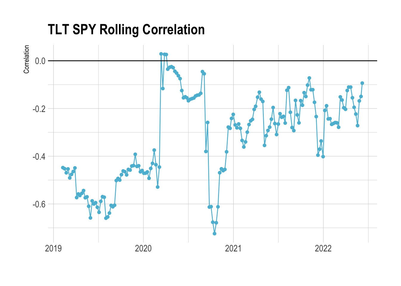
Before COVID, TLT meandered around -0.5 correlation to SPY. So it was quite strongly anti-correlated - whenever SPY went up these bonds went down and vice versa. This makes it a good hedge to the general stock market, if SPY goes through a period of negative returns your overall portfolio doesn’t suffer because the bonds will be going up. This is why you hear people talking about the classic 60/40 portfolio, 60% in stocks, and 40% in bonds.
So whilst bonds might be used as the anti-correlation tool bet in your classic 60/40 portfolio we can see that it isn’t always the case. There can be periods, in this case, COVID, where the anti-correlation is reduced and bonds and stocks were no longer anti-correlated. For a brief period, they had a weak positive correlation! Furthermore, we can see that since 2021 they have been less anti-correlated to stocks, so reducing the effectiveness as a portfolio hedge, SPY moving down doesn’t produce an increase in TLT like it previously did.
Why is this? As central banks are increasing base rates, inflation is ramping up and other macro factors, it looks like we are entering a new market regime where we might have to rethink the asset allocation.
So if the TLT bonds are not as good a hedge, what else could we potentially use?
Correlation Clustering
We’ve got an idea of what correlation means, we know that it might change over time. We also know that different types of assets will react to different moves in other asset classes, so how can we classify similar assets?
If we calculate the full correlation matrix across all the data we can see clusters in the correlations.
corVals <- cor(allData %>%
                 dplyr::select(contains("logreturn"),
                               -contains("cum"))) %>%
  as.data.frame
corVals %>% tibble::rownames_to_column(var = "Ticker1") -> corVals

corVals %>%
  pivot_longer(-contains("Ticker1"),
               names_to = "Ticker2",
               values_to = "Correlation") %>%
  mutate(Ticker1 = gsub("_logreturn", "", Ticker1),
         Ticker2 = gsub("_logreturn", "", Ticker2)) -> corValsTidy
ggplot(corValsTidy,
       aes(x=Ticker1, y=Ticker2, fill= Correlation)) +
  geom_tile( color="black") +
  theme(legend.position = "none",
        axis.text.x = element_text(angle = 90, vjust = 0.5, hjust=1, size=6),
        axis.text.y = element_text(size = 6)) +
  xlab("") + ylab("") +
  scale_fill_gradient2(low = "#FF0000", mid = "white", high="#00A08A", midpoint = 0)
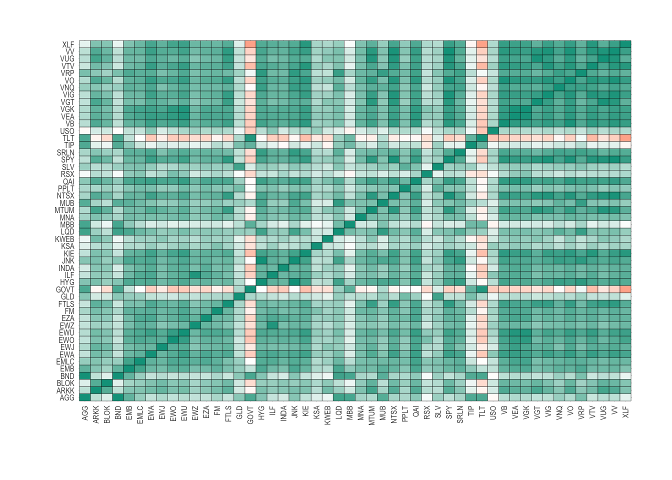
This is the same as the previous figure, but now includes every asset in our universe. We can see some elements of structure, where there are pockets of similar colours showing similar correlations.
To find the clusters in the assets we first need to translate the
correlation matrix (corVals) into a dissimilarity matrix. This is a
type of matrix that measures the pair-wise distances between each
element in the matrix. In R we use the as.dist function.
With the dissimilarity matrix built we pass it through the hclust
function that performs a hierarchical clustering analysis on the
distances. Going through each of the distances can build up a
picture of the ETFs that are ‘close’ together in terms of correlation.
The algorithm starts with each ETF in its cluster and slowly
merges similar clusters until there is one final cluster.
cors <-  corVals %>% dplyr::select(-Ticker1)
names(cors) <- gsub("_logreturn", "", names(cors))
etf <- as.dist(1 - cors)

cl <- hclust(etf)
We draw a dendrogram to visualise these results.
plot(cl, cex=0.75, hang=0)

This is a dendrogram and highlights the nested correlation structure of all the different assets. Starting from the top, we can follow the two branches to the first 2 clusters, a smaller one on the far left.
In the universe object we add the different levels of clustering.
universe %>%
  mutate(CL1 = cutree(cl, 2),
         CL2 = cutree(cl, 3),
         CL3 = cutree(cl, 4)) -> universe
The first of the clusters we find:
universe %>%
  filter(CL1 == 2) %>%
  dplyr::select(Ticker, Description) %>%
  kable
| Ticker | Description |
|---|---|
| AGG | IG Bonds |
| BND | Bonds |
| TLT | 20+yr US Bonds |
| GOVT | US Treasury Bonds |
| TIP | Inflation Bonds |
| MBB | Mortgages |
This is the tightest cluster, so the ETFs are the most similar. Which in our case makes sense as they are all fixed income-based.
If we check how these are correlated to SPY:
cl1 <- universe %>%
  filter(CL1 == 2) %>%
  pull(Ticker)

corValsTidy %>%
  filter(Ticker1 == "SPY",
         Ticker2 %in% cl1) %>%
  kable(digits = 3)
| Ticker1 | Ticker2 | Correlation |
|---|---|---|
| SPY | AGG | 0.267 |
| SPY | BND | 0.256 |
| SPY | TLT | -0.227 |
| SPY | GOVT | -0.204 |
| SPY | TIP | 0.107 |
| SPY | MBB | 0.157 |
Two of them are anti-correlated, the rest are between a low and medium correlation. So whilst we might have expected them to be all anti correlated we need to remember that this correlation clustering is trying to find correlation clusters amongst all the ETFs, so this cluster will have a similar correlation to say oil and gold too.
If we go down a level further, we find precious metals and oil are in this cluster
universe %>%
  filter(CL2 == 2) %>%
  dplyr::select(Ticker, Description) %>%
  kable
| Ticker | Description |
|---|---|
| KSA | Saudi Arabia |
| USO | Oil |
| GLD | Gold |
| SLV | Silver |
| PPLT | Platinum |
To me, it is remarkable how easy this comes out. We are building intuitive clusters that confirm our priors. If we go another level deeper we find that KSA (Saudia Arabia) and USO (Oil) are in their cluster:
universe %>%
  filter(CL3 == 2) %>%
  dplyr::select(Ticker, Description) %>%
  kable
| Ticker | Description |
|---|---|
| KSA | Saudi Arabia |
| USO | Oil |
ggplot(allData %>%
         dplyr::select(timestamp, KSA_logreturn_cum, USO_logreturn_cum) %>%
         pivot_longer(cols = c("KSA_logreturn_cum",
                               "USO_logreturn_cum"),
                      names_to = "ETF",
                      values_to = "cum_logreturn")  %>%
         separate(ETF, into = c("ETF")),
       aes(x=timestamp, y=cum_logreturn, color=ETF)) +
  geom_line() +
  theme(legend.position = "bottom") +
  scale_color_manual(values = wes_palette("Darjeeling1")) +
  xlab("") +
  ylab("Cumulative Return")

When we look at the cumulative log return we can see that they do move in lockstep although USO has much more volatility.
allData %>%
      dplyr::select(SPY_logreturn, KSA_logreturn, USO_logreturn) %>%
  cor %>%
  kable(digits=3)
| SPY_logreturn | KSA_logreturn | USO_logreturn | |
|---|---|---|---|
| SPY_logreturn | 1.000 | 0.397 | 0.376 |
| KSA_logreturn | 0.397 | 1.000 | 0.461 |
| USO_logreturn | 0.376 | 0.461 | 1.000 |
This brings us to the covariance matrix.
Using Correlation in Portfolio Construction
You might think I’ve done this a bit backward, starting with correlation and then moving onto covariance, but hey, need to try and be a little different.
allData %>%
      dplyr::select(SPY_logreturn, KSA_logreturn, USO_logreturn) %>%
  cov %>%
  sqrt %>%
  kable(digits=3)
| SPY_logreturn | KSA_logreturn | USO_logreturn | |
|---|---|---|---|
| SPY_logreturn | 0.029 | 0.017 | 0.028 |
| KSA_logreturn | 0.017 | 0.026 | 0.030 |
| USO_logreturn | 0.028 | 0.030 | 0.073 |
The individual variances of the time series are now the diagonal elements of this matrix. In this oil case, we can see that the USO is about double that of KSA. So if you wanted exposure to oil, would it make sense to but KSA rather than USO as they are highly correlated, but KSA is less volatile.
So lets create 3 very simple portfolios:
- 50% SPY, 50% USO
- 50% SPY, 50% KSA
- 50% SPY, 25% USO, 25% KSA
indReturns <- allData %>% select(SPY_logreturn, KSA_logreturn, USO_logreturn) %>% as.matrix
w1 <- c(0.5, 0, 0.5)
w2 <- c(0.5, 0.5, 0)
w3 <- c(0.5, 0.25, 0.25)
w4 <- c(1, 0,0)

p1 <- rowSums(w1 * indReturns)
p2 <- rowSums(w2 * indReturns)
p3 <- rowSums(w3 * indReturns)
p4 <- rowSums(w4 * indReturns)

p <- data.frame(Date = allData$timestamp,
                P1 = cumsum(p1),
                P2 = cumsum(p2),
                P3 = cumsum(p3),
                P4 = cumsum(p4))
names(p) <- c("Date", "50% USO", "50% KSA", "25% USO 25% KSA", "100% SPY")


pTidy <- p %>% pivot_longer(cols=contains("%"), names_to = "Portfolio", values_to = "Return")

ggplot(pTidy, aes(x=Date, y=Return, color=Portfolio)) +
  geom_line() +
  theme(legend.position = "bottom") +
  scale_color_manual(values = wes_palette("Darjeeling1"))

We can see that the 100% SPY portfolio has the best return. In the blended portfolios, the 50% USO portfolio has the lowest low point.
We can go through each portfolio and calculate some statistics.
- The final return by summing all the log returns.
- The risk by calculating the standard deviation of the log returns.
- The worst day: the most negative one day return.
- Maximum drawdown: the largest range between the max and minimum.
md <- function(x) min(tail(cumsum(x) - cummax(x), -1))

pStats <- data.frame(Portfolio = c("50% USO", "50% KSA", "25% USO 25% KSA", "100% SPY"),
                     Return = vapply(list(p1, p2, p3, p4), sum, numeric(1)),
                     Risk = vapply(list(p1, p2, p3, p4), sd, numeric(1)),
                     WorstDay = vapply(list(p1, p2, p3, p4), min, numeric(1)),
                     MaxDrawDown = vapply(list(p1, p2, p3, p4), md, numeric(1)))

pStats %>%
  kable(digits = 2)
| Portfolio | Return | Risk | WorstDay | MaxDrawDown |
|---|---|---|---|---|
| 50% USO | 0.41 | 0.04 | -0.25 | -0.82 |
| 50% KSA | 0.38 | 0.03 | -0.19 | -0.50 |
| 25% USO 25% KSA | 0.39 | 0.04 | -0.22 | -0.66 |
| 100% SPY | 0.91 | 0.05 | -0.34 | -0.38 |
So whilst 100% SPY has the best return it also has the worst day. The 50% KSA portfolio has the lowest return but also the lowest risk and
In my next post on correlation, I’ll start exploring how we can assign assets to our portfolio based on their correlation and weight them to maximise some outcome. I’ll also rebalance the portfolios at some frequency to ensure that the allocations remain constant. In the above simulation, I am essentially rebalancing every week too, so missing some practical nuances around portfolio construction.
Summary
You hopefully now have an understanding of what correlation means and how it applies to different asset classes. We’ve explored the full correlation structure of our ETF universe and also shown how these values can change overt time. We’ve clustered this correlation structure and found sensible groupings of the different assets that seem to have similar behaviour. Using these groups we found that KSO and USO both move similarly, and KSA provides a proxy for oil without the volatility of investing directly in the commodity.
References
Maxdrawn down function:
The Full ETF Universe
universe %>% select(Ticker, Description) %>% kable
| Ticker | Description |
|---|---|
| SPY | S&P 500 |
| EWA | Australia |
| EWU | UK |
| INDA | India |
| KWEB | China |
| EZA | South Africa |
| EWZ | Brazil |
| RSX | Russia |
| KSA | Saudi Arabia |
| EWJ | Japan |
| EWO | Emerging Markets |
| FM | Frontier Markets |
| ILF | Latin America |
| VGK | Europe |
| VEA | Developed Markets |
| VB | Small Cap |
| VO | Mid Cap |
| VV | Large Cap |
| ARKK | Innovation |
| MTUM | Momentum |
| AGG | IG Bonds |
| BND | Bonds |
| LQD | Corporate Bonds |
| MUB | Muni Bonds |
| EMB | Emerging Market Bonds |
| HYG | High Yield Bonds |
| TLT | 20+yr US Bonds |
| GOVT | US Treasury Bonds |
| TIP | Inflation Bonds |
| MBB | Mortgages |
| JNK | Junk Bonds |
| EMLC | Emerging Market Local Currency |
| SRLN | Bank Loan |
| VNQ | Real Estate |
| MNA | Merger Arb |
| FTLS | Long/Short |
| QAI | Hedge Fund |
| VRP | Preferred |
| NTSX | Efficient Core |
| USO | Oil |
| GLD | Gold |
| SLV | Silver |
| PPLT | Platinum |
| VTV | Value |
| VUG | Growth |
| VGT | IT |
| XLF | Finance |
| VIG | Dividend |
| KIE | Insurance |
| BLOK | Blockchain |