Ratesetter Yield Curve
I will be using R to anaylse the yield curve of the Peer to peer lender RateSetter. This is an exploration of the data RateSetter provide, with the goal of producing a final animation of the yield curve through time.
Enjoy these types of posts? Then sign up for my newsletter.
require(readr)
require(lubridate)
require(dplyr)
require(ggplot2)
require(tidyr)
Peer to Peer Lending
Peer to peer (P2P) lending has seen a steady increase in popularity. As one of the FinTech branches P2P lending aims to democratise lending for both the borrower and lender. RateSetter is one such company. After signing up to their website, you can either invest money or apply for a loan, deepening on whether you have too much money or too little money. In this blog post we will be looking from the perspective of an investor deciding on what product to invest their money in at RateSetter.
RateSetter offer three different time horizons for an investment. A rolling contract where your money can be accessed at any time, a 1 year contract where your money is locked up for 1 year and a 5 year contract, where, you guessed it, your money is locked up for 5 years.
RateSetter are nice enough to provide their historical data for free. They have daily quotes for the different products.
rawData <- read_csv("clean.csv", col_names = F)
names(rawData) <- c("Contract", "Date", "Yield")
rawData %>% mutate(Date = dmy(Date)) -> rawData
rawData %>%
  group_by(Contract) %>%
  summarise(FirstDay = min(Date),
            LastDay = max(Date))
| Contract | FirstDay | LastDay |
|---|---|---|
| 1 Year | 2012-02-23 | 2019-01-03 |
| 3 Year Income | 2010-09-20 | 2019-01-03 |
| 5 Year Income | 2012-02-23 | 2019-01-03 |
| Rolling | 2010-09-20 | 2019-01-03 |
When we look at the raw data we find that there is a discontinued product, the 3 Year Income contract. We can also see that the common start date for the remaining three contracts is the 23rd of Feb.
Lets throw away the 3 year contract and focus on the current available products.
rawData %>% filter(Contract != "3 Year Income",
                   Date > dmy("23-02-2012")) %>% drop_na(Yield) -> cleanData
cleanData %>%
  mutate(Contract = factor(Contract, levels = c("Rolling",
                                                "1 Year",
                                                "5 Year Income"))) %>%
  arrange(Date) -> cleanData
ggplot(cleanData, aes(x=Date, y=Yield, colour=Contract)) +
  geom_line() +
  geom_smooth() +
  labs(y="Yield (%)") +
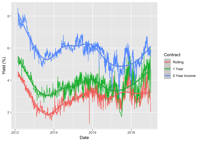
Here we can see that the rates for the different products change quite a lot throughout the dataset. But there is some semblance of structure between the rates. That is not an accident.
Fixed Income 101
When comparing products like this with different lifetimes we need to look at the yield curve. The yield curve is defined at the difference in yield between bonds with different maturities. In this case, our bonds are the three different RateSetter products.
Fundamentally, we always want the bonds with longer duration to yield more than the shorter ones. I.e. we want to be rewarded for locking our money up for longer. Therefore, if we plot the yield vs the duration of the bond we expect to see an increasing trend. If this isn’t the case, then something is amiss.
Normally when people refer to a ‘yield curve’ they are referring to the difference in yields for US Treasury Bonds. The state of the yield curve can be a proxy for the state of the economy. If there is a positive trend, then everything is hunky dory carry on a normal. But, if the long dated bonds have lower yields than the short dated ones - it’s a bad sign. People don’t want to lock their money up for a long time and instead want the security of the shorter maturity bonds.
We apply the same logic to RateSetter bonds. We always expect the 5 year to yield more than the 1 year and likewise the 1 year to yield more than the rolling contract.
choiceDates <- sample(unique(cleanData$Date), 5)
cleanData %>% filter(Date %in% choiceDates) -> subData
ggplot(subData, aes(x=Contract, y=Yield, colour=as.factor(Date), group=Date)) +
  geom_point() +
  geom_line() +
  labs(y = "Yield (%)")
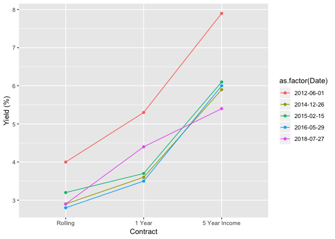
Now with RateSetter, its a bit more complicated and there are more factors at play, mainly due to the overall massively higher risk involved in investing in P2P rather than the US government. But the general theory still holds; the long dated contracts should have a higher yield that the shorter ones. If it doesn’t, well, something is amiss. But this could be for a number of reasons. Figure REF shows the yield curve on some random days. As we can see the general theory holds. The 5 year is always yielding more than the 1 year and the 1 year is yielding more than the rolling contract, all is at peace in the world.
Interestingly, the gradient between rolling and 1 year appears to be flatten out as time progresses. I would attribute this to the maturing of the platform. As more people use and trust RateSetter, there is less of a worry about locking your money up for a year compared to a month, therefore, the spread between month and 1 year tightens. Obviously, the Bank of England rate changed over the time period, which would have also impacted the curve. But as a general thought I reckon it holds. Of course, this is also a tiny sample size and something that requires more investigation before making any conclusions.
Animations
Enough of the finance lesson, lets make some animations.
gganimate is a package that integrates animating with ggplot2.
require(gganimate)
For time and size purposes, we will focus on the yield curve in 2018. The date of the yield curve is our transition variable and we progress through time, watching how the yield curve changes.
cleanData %>% filter(Date >= dmy("01-01-2018")) -> subData

ggplot(subData, aes(x=Contract, y=Yield)) +
  geom_line(aes(group=1)) +
  geom_point() +
  transition_states(Date, transition_length = 1, state_length = 2) +
  enter_fade() +
  exit_shrink() +
  ease_aes('linear') +
  labs(y = "Yield (%)") +
  ggtitle("RateSetter Yield Curve", subtitle = "Date: {closest_state}") +
  theme_minimal() -> p

animate(p, nframes = 1500, fps = 30)
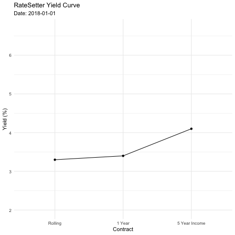
Just like that we get a gif of the yield curve over the last year.
A couple of interesting observations:
- The 5 year income isn’t as variable as the other contracts. Its spread relative to the 1 year looks fairly constant.
- The same cannot be said for the spread between the rolling and 1 year contracts. There are flickers of both flatness and inversion. Overall, the relationship between rolling and 1 year is a lot more complicated.
Now why is this information useful? If you’ve got a chunk of money and want some exposure to P2P lending by looking at the yield curve you can decide whether the rolling product or 1 year is more suited. If the current curve is flat, it might not be worth locking up your money for not much benefit, it might be better to wait for spreads to widen. Obviously, there is also a risk aspect to this, but as a general heuristic it makes sense.
So thanks to the availability of the data we can get a good picture of
the state of the RateSetter market. Using the gganimate package we can
zoom through time and look at the evolution of the yield curve. Overall,
a good exploratory analysis of the data. In the near future I’ll start
looking at some modelling questions and see if we build some predictive
analytics.
If you liked this post, checkout my modelling of the RateSetter yield curve using the Neslson-Siegel model.