The Nelson Siegel Model and P2P Bonds
In an earlier post I looked at the yield curve of the P2P bonds from RateSetter. In this post I’ll be taking the next step by taking a well known financial model and applying it to the bonds to describe the yield curve. This model will provide some parameters that describe the current state of the RateSetter market and allow us to look at the overall history of the yields.
require(readr)
require(dplyr)
require(lubridate)
require(ggplot2)
require(rstan)
require(tidyr)
numIts <- 2000
RateSetter Loan Data
First we need to download the data. RateSetter have recently changed
how they provide the data, now you can pull the csv files straight
from the website using read_csv of the readr package.
baseurl <- "https://members.ratesetter.com/ratesetter_info/marketrates_details.aspx?id="
url <- c(1,3,4)
contract <- c("Rolling", "1Year", '5Year')

rawData <- lapply(seq_along(url), function(i) {

  raw <- read_csv(paste0(baseurl, url[i]), col_names = F)
  names(raw) <- c("Date", "Yield")
  raw$Contract <- contract[i]
  raw
}
)

fullData <- bind_rows(rawData)

fullData %>% mutate(Date = dmy(Date)) -> fullData

ggplot(fullData, aes(x=Date, y=Yield, colour=Contract)) + geom_line()
ggplot(fullData, aes(x=Date, y=Yield, colour=Contract)) + geom_smooth()
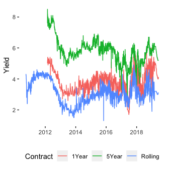
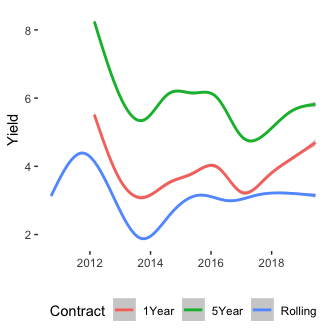
Plotting both the raw data and the smoothed data we can see the familiar pattern of yields that the different products RateSetter offer. We filter down to the exact date all three contracts start trading simultaneously and convert the contract name to a ‘number of months’ until maturity variable.
fullData %>%
  filter(Date > dmy("23-02-2012")) %>%
  mutate(Tau = case_when(Contract == "Rolling" ~ 1,
                         Contract == "1Year" ~ 12,
                         Contract == "5Year"~ 5*12)) -> cleanData
The Nelson-Siegel Model
Now we want a mathematical model that can explain the difference in yields between these products. A popular model in the fixed income space is the Nelson-Siegel model which links the yield of the bond with how long it has left until maturity.
The Nelson-Siegel model for a yield \(y\) of maturity \(\tau\) can be written as
\[y(\tau \mid \beta _0, \beta _1, \beta _2, \lambda) = \beta_0 + (\beta_1 + \beta _2) \cdot \frac{\lambda}{\tau} \left( 1 - \exp (- \frac{\tau}{\lambda}) \right) - \beta _2 \cdot \left( \exp \left( - \frac{\tau}{\lambda} \right) \right)\]where the \(\beta _i\) values have direct interpretations of interest rates and \(\lambda\) is a scaling parameter.
We can write this as an R function and use optimisation to find the best parameters for a given dataset.
nel_sieg <- function(tau, params){

  beta0 <- params[1]
  beta1 <- params[2]
  beta2 <- params[3]
  lambda <- params[4]
  tauScale <- tau/lambda

  y <- beta0 +
    (1/tauScale)*(beta1 + beta2)*(1 - exp(-tauScale)) -
    beta2 * exp(-tauScale)
  return(y)
}


likelihood <- function(params, yield, tau){
  -sum(dnorm(yield, nel_sieg(tau, params[1:4]), params[5], log=T))
}
We run the optimisation 100 different times at different starting values to make sure that the result converges.
cleanData %>% filter(Date >= dmy("01-12-18")) -> subData

replicate(100,
          tryCatch(optim(runif(5)*2,
                         likelihood,
                         yield = subData$Yield, tau=subData$Tau,
                         lower = c(-Inf, -Inf, -Inf, 0.01, 0),
                         method="L-BFGS-B"),
                   error = function(e) NA)) -> optimList

optimVals <- optimList[which(!is.na(optimList))[1]]
optimVals <- optimVals[[1]]
optimVals$par
## [1] 5.28679720 -14.83033739 -15.86626221 0.07097706 0.60202616
These are the parameters that emerge. To check the model results, we plot the Nelson-Siegel results against the actual yield curve.
testTau <- seq(0, 60, by=1)
 estFrame <- data.frame(Tau = testTau,
                        Est=nel_sieg(testTau, optimVals$par[1:4]))

 ggplot(subData, aes(x=Tau, y=Yield)) +
   geom_point() +
   geom_line(data=estFrame, aes(x=Tau, y=Est))
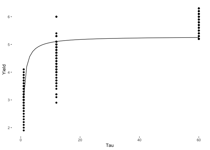
Its not a great fit to the data, but a sensible shape has been recovered. What we do want though, is some uncertainty estimates around the parameters. You can achieve this from the optimisation results, but it would be better to use a Bayesian approach and get uncertainty for free from the sampling.
The Bayesian Nelson-Siegel Model
We can rewrite the above model in Stan and sample from the posterior distribution using Hamiltonian Monte Carlo. The Stan code can be found here
staticModel <- stan_model("../nel_sig.stan")

stanData <- list()

stanData$y <- subData$Yield
stanData$tau <- subData$Tau
stanData$N <- length(stanData$y)

smpls <- sampling(staticModel, data=stanData, chains = 2, iter=numIts, refresh=-1)
## Chain 1:
## Chain 1: Gradient evaluation took 0.000472 seconds
## Chain 1: 1000 transitions using 10 leapfrog steps per transition would take 4.72 seconds.
## Chain 1: Adjust your expectations accordingly!
## Chain 1:
## Chain 1:
## Chain 1:
## Chain 1:  Elapsed Time: 4.48045 seconds (Warm-up)
## Chain 1:                4.54497 seconds (Sampling)
## Chain 1:                9.02542 seconds (Total)
## Chain 1:
## Chain 2:
## Chain 2: Gradient evaluation took 0.000128 seconds
## Chain 2: 1000 transitions using 10 leapfrog steps per transition would take 1.28 seconds.
## Chain 2: Adjust your expectations accordingly!
## Chain 2:
## Chain 2:
## Chain 2:
## Chain 2:  Elapsed Time: 4.33703 seconds (Warm-up)
## Chain 2:                4.38545 seconds (Sampling)
## Chain 2:                8.72248 seconds (Total)
## Chain 2:
smplsEx <- rstan::extract(smpls)

allPars <- cbind(smplsEx$beta0, smplsEx$beta1, smplsEx$beta2, smplsEx$lambda, smplsEx$sigma)

testTau <- seq(0, max(stanData$tau), by=0.5)

allYield <- apply(allPars, 1, function(x) nel_sieg(testTau, x))

plotFrame <- data.frame(Tau=testTau,
                        Mean = rowMeans(allYield),
                        LQ = apply(allYield, 1, quantile, probs=0.025, na.rm=T),
                        UQ = apply(allYield, 1, quantile, probs=1-0.025, na.rm=T))


ggplot(plotFrame) +
  geom_line(aes(x=Tau, y=Mean)) +
  geom_ribbon(aes(x=Tau, ymin=LQ, ymax=UQ), alpha=0.25) +
  geom_point(data=subData, aes(x=Tau, y=Yield), colour="red")
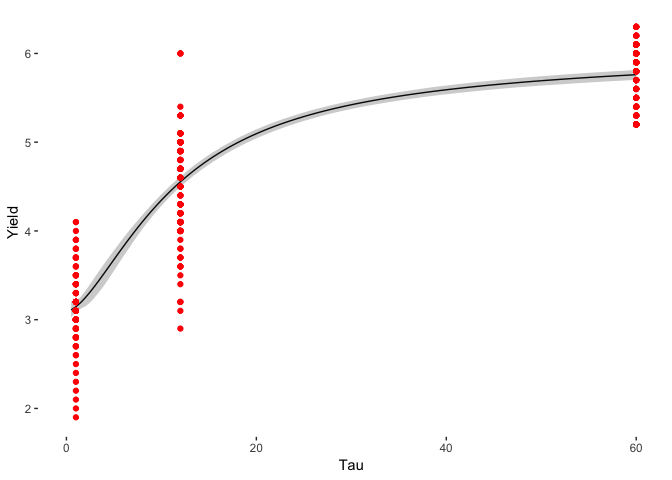
The model works and has recovered a similar answer to the MLE method, but the overall model is not great. Many of the yields fall outside of the 95% confidence interval, which suggests that this model is not adequate. The daily yields change too much for the parameters of the model. This means that we need to modify the model to something that can change overtime.
A Dynamic Bayesian Nelson-Siegel Model
A more general model is to allow the \(\beta\) values to vary over time. We rewrite the above basic model so that the parmeters at each day of the week take on a value that depends of the previous value of the parameter, this means that is can very with each day of the week and there are parameters that control the amount of variation.
\[\beta ^{i} = \theta_0 + \theta _1 \beta ^{i-1}\]This means that the parameter on day \(i\) depends on the previous day by a constant amount \(\theta _0\) and an amount \(\theta _1\) time the previous value.
Again, this type of model is written in Stan (here), but now requires a
change in the data, we need to go from the long to the wide format
which is easily done using spread from dplyr.
cleanData %>%
  select(-Tau) %>%
  spread(Contract, Yield) %>%
  select(Date, Rolling, everything()) -> trainData

stanData <- list()

stanData$y <- trainData[,-1]
stanData$N <- nrow(trainData)
stanData$P <- 3
stanData$tau <- c(1, 12, 5*12)
stanData$forward <- 10

dynamicModel <- stan_model("../nel_sig_dynamic.stan")

smplsDyn <- sampling(dynamicModel, stanData, chains=2, iter=numIts, cores=2, init_r=1)
The sampling takes sometime (about an hour) but everything has been has converged nicely. No worries about divergent transitions which is always a success!
Lets look at the example yield curves. We will chose 5 days at random from the training data and see how the fitted curves line up with the real data.
smplsDynEx <- rstan::extract(smplsDyn)

exampleInds <- sample.int(stanData$N, 5)

exampleCurvesDynamic <- lapply(exampleInds, function(i)
  lapply(1:2000, function(j)
    nel_sieg(testTau, c(smplsDynEx$beta0[j, i],
                        smplsDynEx$beta1[j, i],
                        smplsDynEx$beta2[j, i],
                        smplsDynEx$lambda[j]))
  )
)

lapply(seq_along(exampleCurvesDynamic), function(i){
  x <- exampleCurvesDynamic[i]
  cbind(
    Tau = testTau,
    Mean=rowMeans(as.data.frame(x)),
    t(apply(as.data.frame(x), 1, quantile, probs = c(1-0.025, 0.025), na.rm=T)),
    Day = exampleInds[i])
}) -> exampleCurveQuantiles

dynamicCurves <- as.data.frame(do.call(rbind, exampleCurveQuantiles))
names(dynamicCurves)[3:4] <- c("UQ", "LQ")
dynamicCurves$Day <- as.character(dynamicCurves$Day)

do.call(rbind, lapply(exampleInds, function(i) {
  data.frame(Tau=stanData$tau, Yield=unlist(stanData$y[i, ]), Day=as.character(i), Model="True")
})) -> trueFrame

ggplot(dynamicCurves) +
  geom_ribbon(aes(x=Tau, ymin=LQ, ymax=UQ, fill=Day, group=Day), alpha=0.25) +
  geom_line(aes(x=Tau, y=Mean, colour=Day, group=Day)) +
  geom_point(data=trueFrame, aes(x=Tau, y=Yield, colour=Day)) +
  ylab("Yield")
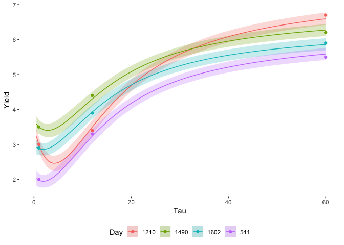
Everything falls nicely in the credible zones, which shows how this model is much better than the previous static one. It takes more time to compute, but the benefit is there. The simple variation allowed in the parameters can adapt to the available data.
How do the \(\beta\) parameters change over time? These are easily extracted from the posterior samples and can be plotted as a function of time.
ratesetterBetas <- extractBetaTimeSeries(smplsDynEx, trainData$Date)

ggplot(ratesetterBetas) +
  geom_ribbon(aes(x=Date, ymin=LQ, ymax=UQ), alpha=0.5) +
  geom_line(aes(x=Date, y=Mean)) +
  facet_grid(Parameter~., scales="free_y")
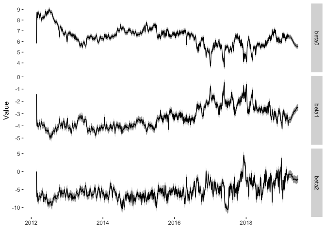
Here are the parameters over time with their 95% credible interval. What do these parameters represent? Here is a handy table:
| Parameter | Meaning |
|---|---|
| \(\beta _0\) | Long term rates |
| \(\beta _1\) | Short term rates |
| \(\beta _2\) | Medium term rates |
Now \(\beta _0\) has been decreasing overtime which suggests that the long term interest rate on RateSetter bonds is also decreasing. I imagine this would be interpreted as confidence improving in the overall platform, mainly because the Bank of England base rate has not changed significantly over this period. The \(\beta _2\) parameter has remained fairly consistent at around -5 overtime, before recently increasing. This is a bit tougher to interpret as there is no real ‘medium’ bond price that we can view the equivalent change in. Likewise, \(\beta _1\) started at a consistent value of -4, before increasing from 2016 and decreasing in 2018. This shows the sensitivity of the short-term rates, reflected in the rolling market, which is by and large the more liquid contract and more likely to experience fluctuations.
In early 2019, RateSetter changed their reporting practises and moved to a 28 day window for reporting the average yield on each of the contracts. You can see this change in the frist figure as the fluctuations have suddenly dipped and the curves are now much smoother. We can see a similar change to this in the \(\beta\) values.
ratesetterBetas %>% filter(Date >= dmy("01-01-2019")) -> ratesetterBetasSub
cleanData %>% filter(Date >= dmy("01-01-2019")) -> yieldSub

ggplot(ratesetterBetasSub) +
  geom_ribbon(aes(x=Date, ymin=LQ, ymax=UQ), alpha=0.5) +
  geom_line(aes(x=Date, y=Mean)) +
  facet_grid(Parameter~., scales="free_y")

ggplot(yieldSub, aes(x=Date, y=Yield, colour=Contract)) + geom_line()
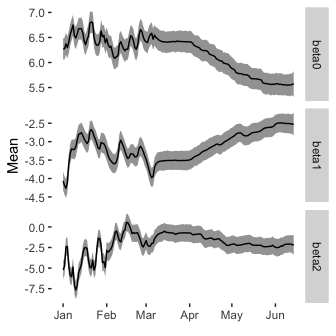
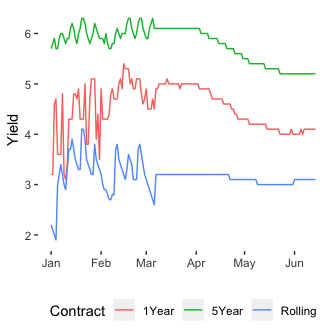
We can see that the parameters of the Nelson-Siegel model have now smoothed out with the smoother yields as inputs. Again, good to see that the model can handle a sudden change in the data. It also makes the trend in the data a little easier to spot. The rolling market has remained fairly constant, whilst the 1 and 5 year markets have decreased, this is reflected in a decrease in the \(\beta_0\) parameter, an increase in the \(\beta _1\) parameter and \(\beta _2\) remaining the same.
Now with just 3 unequally spaced contracts available to buy its hard to see how these different time scales are present themselves in the yields, but the fact that the monthly rate hasn’t changed much whilst the other have decreased indicates that there is potential downward movement on the cards for the monthly contract.
Like all blog posts that involve finance, I could be getting this completely wrong, so don’t go trading the bonds based off this information.
A big help in writing the Stan code was this post by Jim Savage. If you want to know more about the Nelson-Siegel model you can’t go wrong with Wikipedia. A paper on Arxiv does a similar model for US Treasury data.
If you want to read more about RateSetter bonds, you can read my previous post on the basics of the yield curve.