State of the Market - Infinite State Hidden Markov Models
My dirichletprocess package for R has the ability to fit Infinite Hidden Markov
Models using a Dirichlet process. To demonstrate this functionality I
will fit a Hidden Markov model to some financial data to see how the
states change over time and hopefully highlight why this might be
useful.
Enjoy these types of posts? Then you should sign up for my newsletter.
The typical Markov model in finance assumes two states; a bull state where the market is rising and a bear state where the market is falling. By markets rising we mean that the average return is positive and by falling we mean the average return is negative. We then take the return data of some stock, fit this type of model to obtain the state parameters. Then buy the stock when the parameters suggest a bull market, sell it in the bear market and hope you make a profit. This ticks all the boxes for a good model; its simple to explain and simple to fit. However (and this is a big however) it relies on some two assumptions:
- There are only two states
- All the bull states have the same parameters and likewise for the bear states.
Firstly, two states is kind of arbitrary; why not add another “neutral” state where the average return is zero? Or maybe have 4 states, big bear, bear, bull, big bull? Secondly, assuming the state parameters constant for each type of state is very limiting. Why should the bear market of the dot com crash have the same parameters are the Great Financial Crisis?
Quite quickly this model falls apart, and once you start relaxing these assumptions you find that you can always tweak the model to get better results than before.
So how do we fix this?
Enter the Dirichlet process and unsupervised machine learning. A Dirichlet process is a type of random process that can have an infinite amount of parameters. We can use the Dirichlet process to learn a sensible amount of parameters from data where we feed the Dirichlet process model some data and get out suitable clusters and their parameters all in an unsupervised manner. With a few mathematical tweaks we can set the Dirichlet process up as a hidden Markov model to learn from the data so now the assumptions of the Markov model are relaxed:
- Two states → As many states as the data needs.
- Same parameters for each type of state → Each state has its own parameters.
This means we now let the data speak for itself and it can arrange
into suitable states with suitable parameters. I will show how you use
my dirichletprocess package to fit this type of model and how it can
be applied to an ETF’s change in returns.
So if you want to play along at home, download these packages, fire up RStudio and get programming!
You’ll need to download the dev version of diricheltprocess as I
haven’t updated the CRAN release with some new features yet. To do
this
devtools::install_github("dm13450/dirichletprocess")
Then load all the other packages.
set.seed(20202020)
knitr::opts_chunk$set(warning = FALSE, message = FALSE)
require(dirichletprocess)
require(alphavantager)
require(dplyr)
require(tidyr)
require(ggplot2)
require(lubridate)
require(xts)
require(coda)
require(ggrepel)
require(knitr)
require(parallel)
Using the AlphaVantage API we can download the SPY ETF daily price series. We are using the SPY ETF as it is a good indicator of the stock market - if SPY is in a positive return state we should be buying stock, if it is in a negative state we should be selling.
spy <- av_get(symbol = "SPY", av_fun = "TIME_SERIES_DAILY_ADJUSTED", outputsize="full")

spy %>%
  mutate(LogReturns = c(NA, diff(log(adjusted_close))),
         timestamp = ymd(timestamp),
         RollingSD = rollapply(LogReturns, 30, sd, align="right", fill=NA)) -> spy
Before we start fitting the model we normalise the data. We do this by first taking the daily log returns from the closing prices and then dividing by the previous 30 days standard deviation, which acts as a proxy to volatility.
ggplot(spy, aes(x=timestamp, y=LogReturns/RollingSD)) +
  geom_point() +
  ggtitle("Normalised Returns") +
  xlab("") +
  ylab("Log Returns")

ggplot(spy, aes(x=timestamp, y=RollingSD)) +
  geom_line() +
  ggtitle("30 Day Volatility") +
  xlab("") +
  ylab("Volatility")
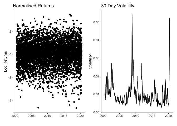
From the normalised returns we can see that the values are bounded between -5 and 2, so a normal distribution will be sufficient to describe them. When we look at the rolling standard deviation we can see that it proxies volatility well, capturing the turbulence of the Great Financial Crisis of 2007-2008 and is currently spiking with this COVID-19 outbreak but is now coming back down.
A Dirichlet Process Hidden Markov Model (DPHMM) works by iterating through the data points and assigning each point to a cluster sequentially. A point can belong to either the previous cluster (yesterday’s cluster) or form its own cluster where the ability to form its own cluster is controlled by the parameters \(\alpha, \beta\). These are hyperparameters which dictate the overall state ‘stickiness’ and how easy it is to form a new cluster. Then once every datapoint has a new state we update the state parameters using all the data assigned to that state. This gives an iterative Bayesian method for fitting these models;
- Iterate over the data assigning it to a state.
- Iterate over the states updating the parameters.
- Update the hyperparameters \(\alpha, \beta\).
Thanks to dirichletprocess you don’t have to worry about any of
this. Instead you can just create the Dirichlet process object with
the data and let my hard work handle all the sampling for you.
spy %>%
  drop_na() %>%
  mutate(y=LogReturns/RollingSD) -> trainFrame

mdobj <- GaussianMixtureCreate()
dphmm1 <- DirichletHMMCreate(trainFrame$y, mdobj,
                             alpha = 1, beta = 1)
dphmm2 <- DirichletHMMCreate(trainFrame$y, mdobj,
                             alpha = 0.1, beta = 0.1)

its <- 75000

dpList <- list(dphmm1, dphmm2)

dpList <- mclapply(dpList, Fit, its=its, progressBar=F, mc.cores=3)
We fit two different DPHMM with different starting parameters to assess how the dependent the number of states is on these parameters. We fit each DP for 75000 iterations and will discard the first 37500 iterations as burnin. The fitting took 17.5 minutes on my late 2013 MacBook Pro.
We use the coda package to assess whether the \(\alpha, \beta\) values
have converged to similar values.
paramCoda <- mcmc.list(lapply(dpList,
                              function(x) mcmc(cbind(Alpha = x$alphaChain,
                                                     Beta = x$betaChain))))

gelman.diag(paramCoda)
## Potential scale reduction factors:
##
##       Point est. Upper C.I.
## Alpha       1.04       1.08
## Beta        1.00       1.00
##
## Multivariate psrf
##
## 1.01
This shows that everything has converged nicely. For more information on convergence of Dirichlet processes you can read my previous blog post.
We now want to see what state each data point has been assigned.
averageStateAllocation1 <- rowMeans(data.frame(dpList[[1]]$statesChain[-(1:its/2)]))
averageStateAllocation2 <- rowMeans(data.frame(dpList[[2]]$statesChain[-(1:its/2)]))

avgStates <- rbind(
  data.frame(Time = trainFrame$timestamp, StateAllocation = averageStateAllocation1, Params = "1"),
  data.frame(Time = trainFrame$timestamp, StateAllocation = averageStateAllocation2, Params = "0.1")
  )

avgStates %>% gather(Model, StateAllocation, -Params) -> avgStatesTidy

ggplot(avgStates, aes(x=Time, y=StateAllocation, colour=Params)) +
  geom_point() +
  theme(legend.position = "bottom") +
  xlab("") +
  ylab("Average State Allocation")
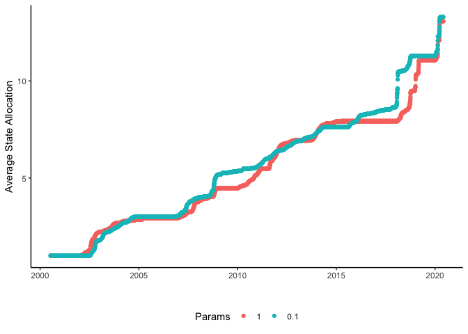
When we plot the average state allocation for each point we can see that the two different DP models have similar state numbers with jumps at similar time. Each jump in state allocation shows a regime shift where the model feels that the next set of returns are better suited with new parameters.
stateAlloc <- data.frame(dpList[[1]]$statesChain[-(1:its/2)])
avg_alloc <- rowMeans(stateAlloc)
lq_alloc <- apply(stateAlloc, 1, quantile, probs = 0.05)
uq_alloc <- apply(stateAlloc, 1, quantile, probs = 0.95)
allocFrame <- data.frame(Time = trainFrame$timestamp, AvgAlloc = avg_alloc, LQ_Alloc=  lq_alloc, UQ_Alloc = uq_alloc)

ggplot(allocFrame, aes(x=Time, y=AvgAlloc, ymin=LQ_Alloc, ymax=UQ_Alloc)) +
  geom_line() +
  geom_ribbon(alpha=0.25) +
  xlab("") +
  ylab("Average State Allocation")
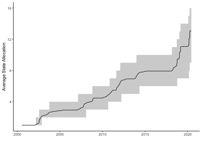
This is a Bayesian model so we can easily extract out the uncertainty around the state allocations and get an idea about how confident we can be about each of the states. The black line above indicates the average state with the grey band around the line shows the 95% credible interval. We can see that the more recent states have been more uncertain.
State Parameters
Now that we know that there are states in the data we want to examine the actual values of the state parameters and see what that can tell us about the state of the world over time.
burnin <- (its/2):its
allMus <- vector("list", length(burnin))
allSigmas <- vector("list", length(burnin))

for(i in seq_along(burnin)){
  allparams <- dpList[[1]]$paramChain[[burnin[i]]][dpList[[1]]$statesChain[[burnin[i]]]]
  allMus[[i]] <- sapply(allparams, "[[", 1)
  allSigmas[[i]] <- sapply(allparams, "[[", 2)
}
allMusMatrix <- do.call(cbind, allMus)
allSigmasMatrix <- do.call(cbind, allSigmas)

avgMus <- rowMeans(allMusMatrix)
avgSigmas <- rowMeans(allSigmasMatrix)

lqMus <- apply(allMusMatrix, 1, quantile, probs=0.05)
uqMus <- apply(allMusMatrix, 1, quantile, probs=0.95)

lqSigmas <- apply(allSigmasMatrix, 1, quantile, probs=0.05)
uqSigmas <- apply(allSigmasMatrix, 1, quantile, probs=0.95)
Give that we are convinced that the two fitting runs have converged to the same result, we will take the values from the first object to conduct the rest of our analysis.
trainFrame %>%
  mutate(AvgState = averageStateAllocation1,
         Mu = avgMus,
         LQ_Mu = lqMus,
         UQ_Mu = uqMus,
         Sigma = avgSigmas,
         LQ_Sigma = lqSigmas,
         UQ_Sigma = uqSigmas,
         DiffState = c(NA, diff(AvgState)),
         StateChange = if_else(DiffState > 0.05, 1, 0)) -> trainFrame

trainFrame %>% filter(StateChange != 0) -> stateChangesDF
trainFrame %>% mutate(PlotColour = if_else(Mu > 0, "Positive", "Negative")) -> trainFrame

ggplot(trainFrame, aes(x=timestamp, y=adjusted_close, colour=PlotColour)) +
  geom_point(size = 0.5) +
  theme(legend.position = "bottom", legend.title = element_blank()) +
  xlab("") +
  ylab("Price")
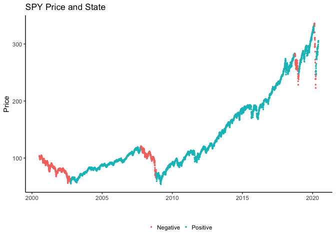
Here we have plotted the closing price of the SPY ETF over time, with the dashed lines separating the different states that the model has found and then the colours indicating whether we are in a positive return period (bull) \(\mu > 0\) or a negative return period (bear) \(\mu < 0\). Most of the time we’ve been in continual positive return, with only the volatility changing. We can see though that the Great Financial Crisis had a negative return period, as did early 2018. Unsurprisingly we are just leaving a negative return period and have transitioned into a positive return state as the world adjusts to the ‘new normal’. Funnily enough I’ve had this blog post sitting in the drafts for a while, I didn’t like the fact that it was constantly in a positive return state so be careful what you wish for I suppose.
ggplot(trainFrame, aes(x=timestamp, y=Mu, ymin=LQ_Mu, ymax=UQ_Mu)) +
  geom_hline(yintercept = 0, linetype = "dashed") +
  geom_line() +
  geom_ribbon(alpha=0.25) +
  xlab("")

ggplot(trainFrame, aes(x=timestamp, y=Sigma, ymin=LQ_Sigma, ymax=UQ_Sigma)) +
  geom_line() +
  geom_ribbon(alpha = 0.25) +
  xlab("")
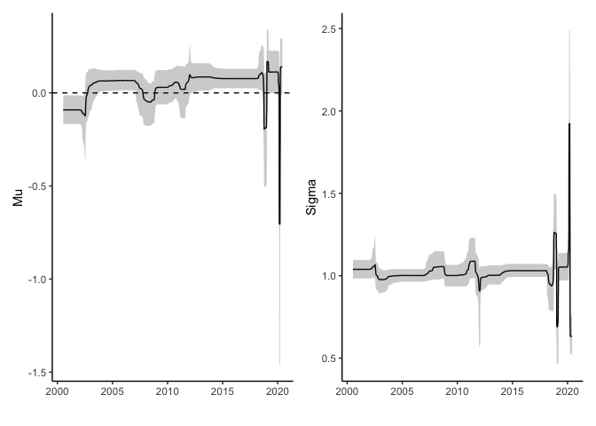
Here we can see that there have only been four states with negative average \(\mu\) and the most recent negative state was very negative. The rest are all positive each with slightly different volatility.
This \(\sigma\) parameter is distributed around 1 because we normalised the return with the standard deviation so any changes in this parameter must also be combined with the rolling volatility we calculated at the start. Most recently the volatility has seen more changes with a particularly high spike during the COVID crisis.
Conclusion
We have broken away from the typical Markov model and instead learnt the best fitting amount of states from the data which each also have their own parameters.
From these results it looks like we are through the worst of the negative returns and have transitioned into a positive return state with smaller volatility which you could use as evidence to rotate back into stocks as this new state. However it is not exactly predictive as we don’t know when the state will change next until we observe the new returns. We could empirically calculate the average length of state, but just by looking at the average state allocations we can see that the recent market behaviour is leading to large uncertainty as to where we actually are.
Overall, this type of model is useful for quantifying the types of states a time-series has gone through which helps us make judgement what is likely to happen in the future, or the short term future at least. You could start looking at other asset classes (TLT, GLD etc.) to see if they have gone through similar state changes and use that to make asset allocation decisions, i.e. SPY is now in a negative state so we should rotate to GLD if it is in a positive state, or even a negative state with smaller volatility!
Further Reading
- The GitHub page for my package dirichletprocess
- The original paper here