Modelling Microstructure Noise Using Hawkes Processes
Microstructure noise is where the price we observe isn’t the ‘true’ price of the underlying asset. The observed price doesn’t diffuse as we assume in your typical derivative pricing models, but instead, we see some quirks in the underlying data. For example, there is an explosion of realised variance as we use finer and finer time subsampling periods.
Last month I wrote about calculating realised volatility and now I’ll be taking it a step further. I’ll show you how this microstructure noise manifests itself in futures trade data and how I use a Hawkes process to come up with a price formation model that fits the actual data.
The original work was all done in Modeling microstructure noise with mutually exciting point processes. I’ll be explaining the maths behind it, showing you how to fit the models in Julia and hopefully educating you on this high-frequency finance topic.
Enjoy these types of posts? Then you should sign up for my newsletter.
A Bit of Background
My Ph.D. was all about using Hawkes processes to model when things happen and how these things are self-exciting. You may have read my work on Hawkes process before, either through my Julia package HawkesProcess.jl, or examples of me using Hawkes processes to model terror attack data or just how to calculate the deviance information criteria of a Hawkes process. The real hardcore might have read my Ph.D. thesis.
But how can we use a Hawkes process to model the price of some financial asset? There is a vast amount of research and work about how Hawkes processes can be used in price formation processes for financial instruments and high-frequency types of problems and this post will act as a primer to anyone interested in using Hawkes processes for such problems.
The High-Frequency Problem
At short timescales, a price moves randomly rather than with any trend. Amazon stock might trade thousands of times in a minute but that’s supply and demand changing rather than people thinking Amazon’s future is going to change from one minute to the next. So we need a different way of thinking about how prices move at short timescales compared to longer timescales.
We can build nice mathematical models guessing how a price might move; it might move like a random walk or maybe a random walk with jumps in the price now and then. But, no matter what model we use, it must match up with what is observed in the real world. One of these observations is a phenomenon called ‘microstructure noise’ and we only see it in high-frequency data.
Microstructure noise is a catch-all term for different things happening in the market. This includes, bid-ask bounce, people buy and sell at two different prices, so looks like the price is moving, but in reality, just oscillating around the mid-price. The discreteness of prices at these time scales also plays a part. There is a minimum increment level that prices change buy and this can have real effects on how prices move. Exchanges need to pay attention to their tick sizes, as it can help or hinder liquidity if they are set incorrectly. This then has a real effect that we can observe when we calculate a realised volatility.
Realised volatility is measuring how much the price moved in a period. These high-frequency effects are going to give the impression of more movement than what the ‘true’ volatility is. So we end up seeing our measurement of volatility explode as the time scale we use gets smaller and smaller. Calculating the volatility using 1-second intervals gives a larger value than if we used 1 minute intervals. This means that our volatility estimation depends on the time scale used, so what is the ‘real’ volatility?
We aren’t interested in working out what the real volatility is. Instead, we want to build a model for a price that displays this volatility scaling effect.
The Hawkes Process Model for a Price
How do we use Hawkes processes to build a model that will have this microstructure noise?
Lets call the price at time \(t\), \(X(t)\) and guess that it moves by summing up the positive jumps \(N_1(t)\) and negative jumps \(N_2(t)\) that also happen at time \(t\).
\[X(t) = N_1(t) - N_2(t)\]When do these jumps occur? How are these jumps distributed? This is where we use the Hawkes process.
A Hawkes process is a self-exciting point process. When something happens it increases the probability of another event happening. This is the self-exciting behaviour we want. Every time there is a positive jump, there is an increase in the probability of a negative jump happening and, likewise, when there is a negative jump there is a greater probability of a positive jump.
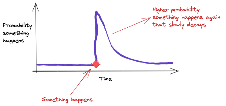 Each jump causes the probability of the other jump happening like in
this picture
When someone buys and pushes the price higher by removing that liquidity, it’s more likely that someone will now sell at the new higher price introducing some downward pressure. This is mean reversion where prices move higher and then outside forces push it lower and vice versa.
With Hawkes processes there are three parameters:
- The background rate or when the jumps randomly occur. This is common to both positive and negative jumps.
- \(\kappa\) - the ‘force’ that pushes and increases the probability of the other jump happening.
- The kernel \(g(t)\) dictates how long the force lasts. This is an exponential decay with parameter \(\beta\).
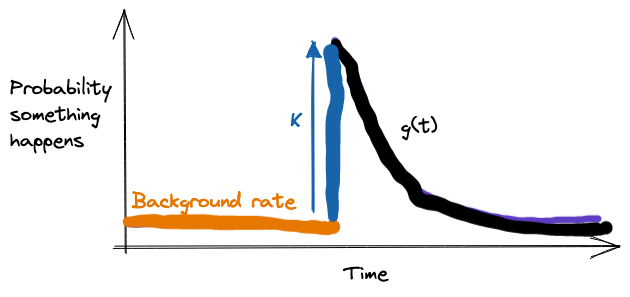
We will fit a Hawkes process to a price series to infer the 3 parameters that describe how the jumps behave. This model will hopefully replicate the ‘microstructure noise’ effects we see in practise.
Futures Trade Data
In the early days of my Ph.D., I answered an email that was advertising for early grad students to do some prop trading. As part of the interview, they gave me some data and asked me to write a simple moving cross-over strategy. I failed miserably as I never heard back from them. But I did get some nice data, which now that I’m older and wiser, recognise as reported trades from a futures exchange. This is the data we will be using today to calculate the mode and luckily it’s similar to the data they use in the original paper.
using CSV
using DataFrames, DataFramesMeta
using Plots
using Dates
using Statistics
All the usual packages when working with data in Julia.
rawData = CSV.read("fgbl__BNH14_clean.csv", DataFrame, header=false)
rename!(rawData, [:UnixTime, :Price, :Volume, :DateTime]);
first(rawData, 5)
5 rows × 4 columns
| UnixTime | Price | Volume | DateTime | |
|---|---|---|---|---|
| Int64 | Float64 | Int64 | String | |
| 1 | 1378908794086 | 136.9 | 1 | 09/11/201315:13:14.086 |
| 2 | 1378974046854 | 137.25 | 5 | 09/12/201309:20:46.854 |
| 3 | 1378990110771 | 137.55 | 1 | 09/12/201313:48:30.771 |
| 4 | 1378998136894 | 137.7 | 1 | 09/12/201316:02:16.894 |
| 5 | 1378999992561 | 137.55 | 1 | 09/12/201316:33:12.561 |
To clean the data we convert the Unix timestamp to an actual DateTime object and pull out the hour and the date of the trade.
cleanData = @transform(rawData, DateTimeClean = DateTime.(:DateTime, dateformat"mm/dd/yyyyHH:MM:SS.sss"),
                                DateTimeUnix = unix2datetime.(:UnixTime ./ 1000) )
cleanData = @transform(cleanData, Date = Date.(:DateTimeUnix),
                                  Hour = hour.(:DateTimeUnix));
first(cleanData[:,[:UnixTime, :DateTimeClean, :DateTimeUnix]], 5)
5 rows × 3 columns
| UnixTime | DateTimeClean | DateTimeUnix | |
|---|---|---|---|
| Int64 | DateTime | DateTime | |
| 1 | 1378908794086 | 2013-09-11T15:13:14.086 | 2013-09-11T14:13:14.086 |
| 2 | 1378974046854 | 2013-09-12T09:20:46.854 | 2013-09-12T08:20:46.854 |
| 3 | 1378990110771 | 2013-09-12T13:48:30.771 | 2013-09-12T12:48:30.771 |
| 4 | 1378998136894 | 2013-09-12T16:02:16.894 | 2013-09-12T15:02:16.894 |
| 5 | 1378999992561 | 2013-09-12T16:33:12.561 | 2013-09-12T15:33:12.561 |
To get an idea of the data we are looking at I aggregate the total number of trades and total volume of the trades over each day and plot that as a time series.
dayData = groupby(cleanData, :Date)
dailyVolumes = @combine(dayData, TotalVolume = sum(:Volume),
                                  TotalTrades = length(:Volume),
                                  FirstTradeTime = minimum(:DateTimeUnix))

xticks = minimum(dailyVolumes.Date):Month(2):maximum(dailyVolumes.Date)
xticks_labels = Dates.format.(xticks, "yyyy-mm")

p1 = plot(dailyVolumes.Date, dailyVolumes.TotalVolume, seriestype=:scatter, label="Daily Volume", legend = :topleft, xticks = (xticks, xticks_labels))
p2 = plot(dailyVolumes.Date, dailyVolumes.TotalTrades, seriestype=:scatter, label= "Daily Number of Trades", legend = :topleft, xticks = (xticks, xticks_labels))
plot(p1, p2, fmt=:png)
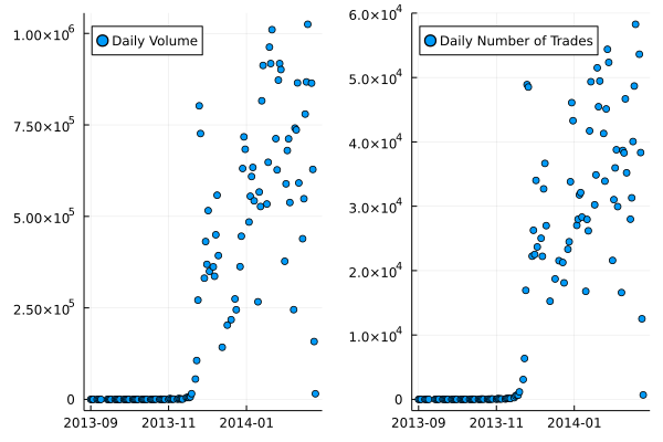
It takes a while for the trading to take off in this future contract. This is where it slowly becomes the front-month contract and then is the most active.
Also, because trading doesn’t cross over the daylight saving dates, we don’t have to worry about timezones. Always a bonus!
What about if we look at what hour is the most active?
hourDataG = groupby(cleanData, [:Date, :Hour])
hourDataS = @combine(hourDataG, TotalHourVolume = sum(:Volume),
                                  TotalHourTrades = length(:Volume))
hourDataS = leftjoin(hourDataS, dailyVolumes, on=:Date)

hourDataS = @transform(hourDataS, FracVolume = :TotalHourVolume ./ :TotalVolume)

hourDataG = groupby(hourDataS, :Hour)
hourDataS = @combine(hourDataG, MeanFracVolume = mean(:FracVolume),
                                 MedianFracVolume = median(:FracVolume))
sort!(hourDataS, :Hour)
bar(hourDataS.Hour, hourDataS.MedianFracVolume * 100, title = "Fraction of Daily Volume", label=:none, fmt=:png)
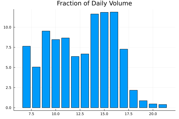
Early in the morning (just after the exchange opens) and late afternoon (when the Americans start trading) is where there is the most activity.
For our analysis, we are going to be focused on the hours 14, 15, 16 to make sure that we have the most active period and this is the same as what the original paper did, took a subset of the day.
How to Calculate the Volatility Signature
Let \(X(t)\) be the price of the future at time \(t\). The signature is the quadratic variation over a window of \([0, T]\), which is more commonly known as the realised volatility:
\[C(\tau) = \frac{1}{T} \Sigma _{n=0} ^{T/\tau} \mid X((n+1) \tau) - X(n \tau) \mid ^2 .\]\(\tau\) is our sampling frequency, say every minute, etc.
To calculate the volatility across the trades we have to pay particular attention to the fact that these trades are irregularly spaced, so we need to fill forward the price for every \(t\) value.
function get_price(t::Number, prices, times)
    ind = min(searchsortedfirst(times, t), length(times))
    sp = ind == 0 ? 0 : prices[ind]
end

function get_price(t::Array{<:Number}, prices, times)
    res = Array{Float64}(undef, length(t))
    for i in eachindex(t)
        res[i] = get_price(t[i], prices, times)
    end
    res
end
Our get_price function here will return the last price before time \(t\).
To calculate the signature value we chose a \(\tau\) value, generate the indexes between 0 and \(T\) using a \(\tau\) step size. Pull the price at those times and calculate the quadratic variation. Again, we add a method to calculate the signature for different \(\tau\)’s.
function signature(tau::Number, x, t, maxT)
    inds = collect(0:tau:maxT)
    prices = get_price(inds, x, t)

    rets = prices[2:end] .- prices[1:(end-1)]
    (1/maxT) * sum(abs.(rets) .^ 2)
end

function signature(tau::Array{<:Number}, x, t, maxT)
   res = Array{Float64}(undef, length(tau))
    for i in eachindex(res)
        res[i] = signature(tau[i], x, t, maxT)
    end
    res
end
Now let’s apply this to the data. We are only interested when the future was actively trading and in the hours between 14:00 and 16:00. We convert the times into seconds since 15:59:59 and calculate the signature for all the dates, before taking the final average.
We are taking the log price of the last trade to represent our actual \(X(t)\). We just look at 2014 dates too as that is when the future is active.
cleanData2014 = @subset(cleanData, :Date .>= Date("2014-01-01"))

uniqueDates = unique(cleanData2014.Date)

eventList = Array{Array{Float64}}(undef, length(uniqueDates))
priceList = Array{Array{Float64}}(undef, length(uniqueDates))

signatureList = Array{Array{Float64}}(undef, length(uniqueDates))
avgSignature = zeros(length(1:1:200))

for (i, dt) in enumerate(uniqueDates)

    subData = @subset(cleanData2014, :Date .== dt, :Hour .<= 16, :Hour .>= 14)
    eventList[i] = getfield.(subData.DateTimeClean .- (DateTime(dt) + Hour(14) - Second(1)), :value) ./ 1e3
    priceList[i] = subData.Price

    signatureList[i] = signature(collect(1:1:200), log.(priceList[i]), eventList[i] .+ rand(length(eventList[i])), 3*60*60 + 1)
    avgSignature .+= signatureList[i]
end

avgSignature = avgSignature ./ length(eventList);
To plot the signature we take the average across all the dates and then normalised by the \(\tau = 60\) value.
plot(avgSignature / avgSignature[60], seriestype=:scatter,
    label = "Average Signature", xlabel = "Tau", ylabel = "Realised Volatility (normalised)", fmt=:png)
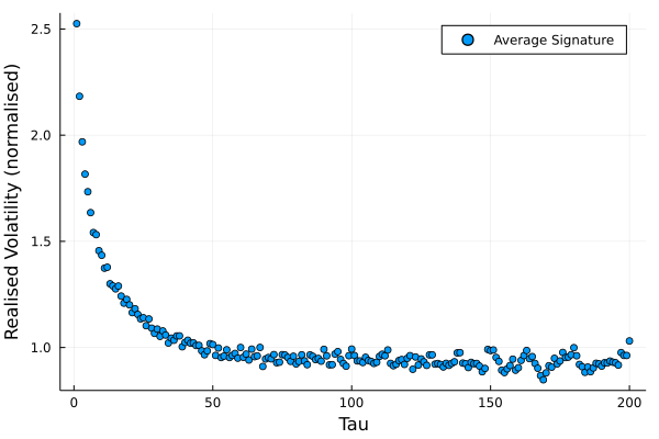
This is an interesting plot with big consequences in high-frequency finance.
This explosion in realised volatility at small timescales (\(\tau \rightarrow 0\)) comes from microstructure noise. If prices evolved as Brownian motion, the above plot would be flat for all timescales so the above result contradicts lots of classical finance assumptions.
Practically, this is a pain if we are trying to measure the currently volatility, it depends on the timescale we are looking at, there isn’t one true volatility using the normal methods. Instead, we need to be aware of these microstructure effects as we use a finer \(\tau\) over which to calculate the volatility.
This is where the Hawkes model comes in. If we assume the price, \(X(t)\) moves as stated in Equation (), can we produce a similar signature plot?
The Theoretical Signature Under a Hawkes Process
After doing some maths (you can read the paper for the full details), we arrive at the following equation for the theoretical signature.
If both \(N_1\) and \(N_2\) are realisations of Hawkes processes with parameters \(\mu, \kappa\) and \(g(t) = \beta \exp (-\beta t)\) then their intensity can be written as
\[C(\tau) = \Lambda \left( k ^2 + (1 - k ^2) \frac{1 - e ^{-\gamma \tau}}{ \gamma \tau} \right),\]where
\(\Lambda = \frac{2 \mu}{1 - \kappa}, k = \frac{1}{1 + \kappa}, \gamma = \beta (\kappa + 1)\).
These are from the paper and adjusted based on my parameterisation of the Hawkes process. This gives us our theo_signature function.
function theo_signature(tau, bg, kappa, kern)
    Lambda = 2*bg/(1-kappa)
    k = 1/(1 + kappa)
    gamma = kern*(kappa + 1)
    @. Lambda * (k^2 + (1-k^2) * (1 - exp(-gamma * tau)) / (gamma*tau))
end
Calibrating the Hawkes Process Model
We now move on to fitting the Hawkes process to the data. I’ll be using a new method that takes a different approach to my package HawkesProcesses.jl.
We have a theoretical volatility signature from a Hawkes process
(theo_signature) and the above plot of what the actual signature
looks like it. Therefore, it is just a case of optimising over a loss
function to find the best fitting parameters. I’ll use root mean
square error as my loss function and simply use the Optim.jl package
to perform the minimisation.
signatureRMSE(x, sig) = sqrt(
    mean(
        (sig .- theo_signature(1:200, x[1], x[2], x[3])).^2
        )
)

using Optim
optRes = optimize(x->signatureRMSE(x, avgSignature/avgSignature[10]), rand(3))

paramEst = Optim.minimizer(optRes)
3-element Vector{Float64}:
 0.24402236592012655
 0.7417867072115396
 0.19569169443936185
These are the three parameters of the Hawkes process which appear sensible.
plot(avgSignature, label="Observed", seriestype=:scatter)
plot!(avgSignature[10]*theo_signature(1:200, paramEst[1], paramEst[2], paramEst[3]), label="Theoretical", lw=3, xlabel = "Tau", ylabel = "Realised Variance", fmt=:png)
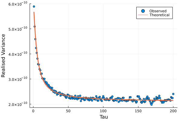
So a nice match-up between the theoretical signature and what we observed. This gives some weight to the Hawkes model as a representation of the price process.
Interpreting the Hawkes Parameters
Our \(\kappa\) value of 0.75 shows there is a large amount of excitement with each price jump. a \(\beta\) value of 0.2 shows that this mean reversion lasts for about 5 seconds. So if we see an uptick in the price, we expect a downtick with a rough half-life of five seconds. The opposite is also true, a downtick likely leads to an uptick 5 seconds later.
Conclusion
Microstructure noise shows up when we start calculating volatility on a high-frequency timescale. We have shown that it is a real effect using some futures data and then built a Hawkes model to try and reproduce this effect. We managed to get the right shape of the volatility signature and found that was quite a bit of mean reversion between the up and downticks that lasted around 5 seconds.
What’s next? In a future post, I will introduce another dimension and show and there can also be correlation across assets under a similar method to reproduce another high-frequency phenomenon. This will be based on the same paper and show you how we can start looking at the correlation between two assets and how that changes at high-frequency time scales.