Modelling Soccer Goals as a Point Process
Goals occur at random times during football matches but we can use a point process to model their occurrences and understand how they are distributed over time. This blog post goes through how to estimate this type of point process model.
Enjoy these types of posts? Then sign up for my newsletter.
I’ve written before about predicting the number of goals in a game and this is a compliment to that post. Part of my PhD involved fitting a multidimensional Hawkes process to the time of goals scored by the home and away teams and this post isn’t as complicated as that instead we look at something simpler.
This is a change of language too, I’m writing R instead of Julia for once!
require(jsonlite)
require(dplyr)
require(tidyr)
require(ggplot2)
knitr::opts_chunk$set(fig.retina=2)
require(hrbrthemes)
theme_set(theme_ipsum())
extrafont::loadfonts()
require(wesanderson)
I have a dataset that contains the odds and the times of goals for many different football matches.
finalData <- readRDS("/Users/deanmarkwick/Documents/PhD/Research/Hawkes and Football/Data/allDataOddsAndGoals.RDS")
We do some wrangling of the data, converting it from the JSON format to give us a vector of each team’s goals split into whether they are home or away.
homeGoalTimes <- lapply(finalData$home.mins.goal, fromJSON)
awayGoalTimes <- lapply(finalData$away.mins.goal, fromJSON)
allGoals <- c(unlist(homeGoalTimes), unlist(awayGoalTimes))
To clean the data we need to replace the games without scores to a numeric type and also truncate any goals scored in extra time. We need a fixed window for the point process modeling.
replaceEmptyWithNumeric <- function(x){
  if(length(x) == 0){
    return(numeric(0))
  }else{
    return(x)
  }
}

max90 <- function(x){
  x[x > 90] <- 90
  return(x)
}

homeGoalTimesClean <- lapply(homeGoalTimes, replaceEmptyWithNumeric)
homeGoalTimesClean <- lapply(homeGoalTimesClean, max90)

awayGoalTimesClean <- lapply(awayGoalTimes, replaceEmptyWithNumeric)
awayGoalTimesClean <- lapply(awayGoalTimesClean, max90)
As the number of goals scored for each team will be proportional to the strength of the team we will use the odds of the team winning the match as a proxy for their strength. This does a good job as my previous blog post Goals from team strengths explored.
homeProbsStrengths <- finalData$PSCH
awayProbsStrengths <- finalData$PSCA

allStrengths <- c(homeProbsStrengths, awayProbsStrengths)
allGoalTimes <- c(homeGoalTimesClean, awayGoalTimesClean)
Interestingly we can do the same cleaning in dplyr easily using the
case_when function.
allGoalsFrame <- data.frame(Time = allGoals)
allGoalsFrame %>%
  mutate(TimeClean = case_when(Time > 90 ~ 90,
                               TRUE ~ as.numeric(Time))) -> allGoalsFrame
After all that we can plot our distribution of goal times.
ggplot(allGoalsFrame, aes(x=TimeClean, y=after_stat(density))) +
  geom_histogram(binwidth = 1) +
  xlab("Time (mins)") +
  ylab("Goal Density")
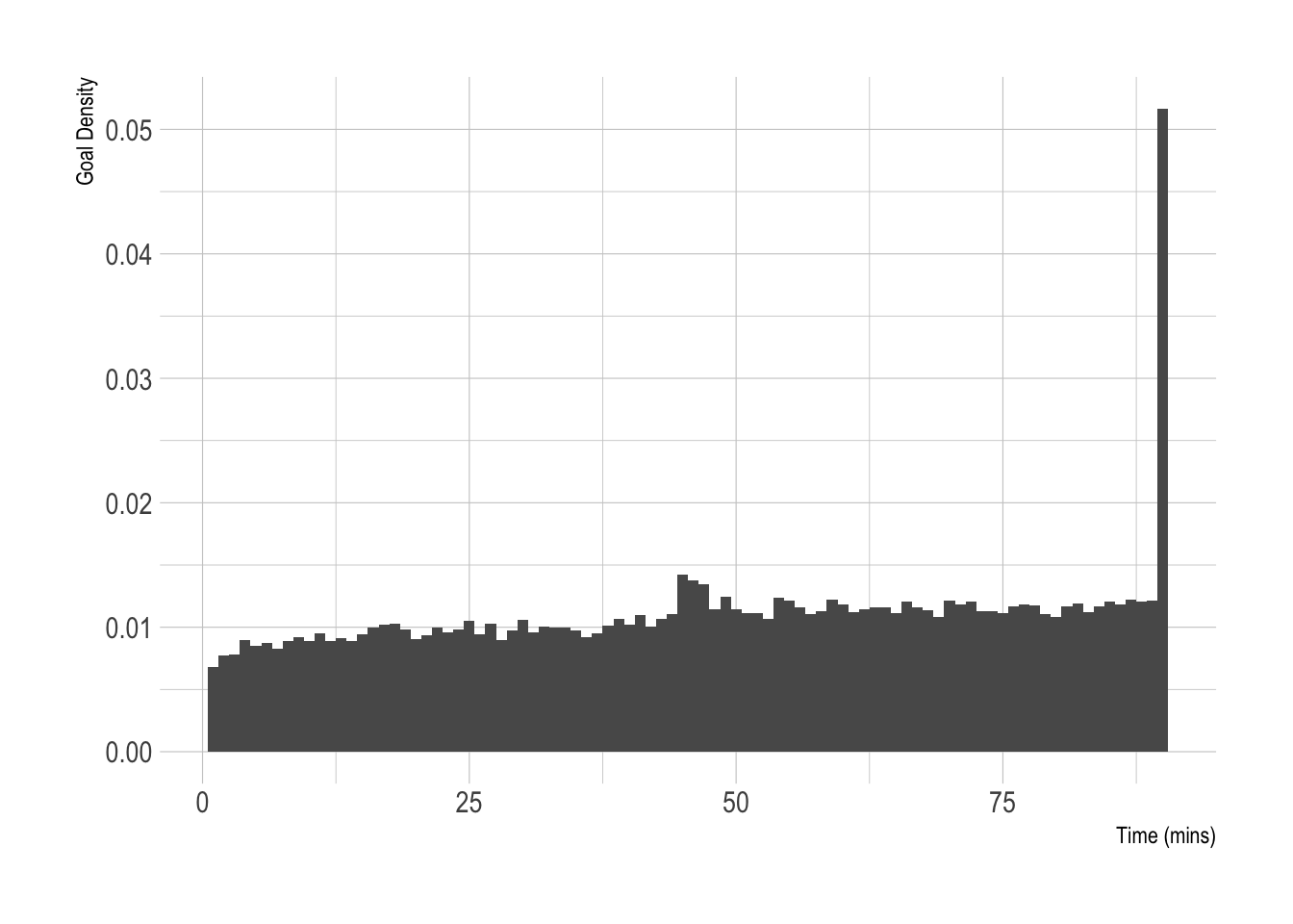
Two bumps, 1 around 45 minutes where goals are scored during extra time in the first half and the 90+ minute goals.
This is what we are trying to model. We want to predict when the goals will happen based on that team’s strength, which will also control how many goals are scored.
Point Process Modelling
A point process is a mathematical model that describes when things happen in a fixed window. Our window is the 90 minutes of the football match and we want to know where the goals fall in this window.
A point process is described by its intensity \(\lambda (t)\) which is proportional to the likelihood of seeing an event at time \(t\). So a higher intensity, a larger chance of a goal occurring. From our plot above we can see there are two main features we want our model to capture:
- The general increase in goals as the match as time progresses.
- The spike at 90 because of extra time.
To fit this type of model we will write an intensity function \(\lambda\) and optimise the parameters to minimise the likelihood.
The likelihood for a point process is the summation of the intensity \(\lambda(t)\) at each event and the integration of the intensity function over the window
\[\mathcal{L} = \sum _{i} \log \lambda (t_i) - \int _0^T \lambda (t) \mathrm{d} t.\]We have to specify the form of \(\lambda\) with a function and parameters and then fit the parameters to the data. By looking at the data we can see the intensity appears to be increasing and we need to account for the spike at 90
\[\lambda (t) = w \beta _0 + \beta _1 \frac{t}{T} + \beta _{90} \delta (t-90),\]where \(w\) is the team strength, \(T\) is 90 and \(\delta (x)\) is the Dirac delta function. More on that later.
Which we can easily integrate.
\[\int _0^T \lambda(t) = w \beta_0 T + \beta _1 \frac{T}{2} + \beta_{90}.\]This gives us our likelihood function so we can move on to optimising it over our data.
Starting via Simulation
It’s always good to make sure you are on the right track by simulating the models you are exploring. Jumping straight into the real data means you are hoping your methods are correct, but starting with a known model and using the methods to recover the parameters gives you some confidence that what you are doing is correct.
There are three components to our model:
- the intensity function
- the integrated intensity function
- the likelihood
We will also be using a Dirac delta function to represent the 90 minute spike
The Dirac Delta Function
Given our data is measured in minutes and all the goals that happen in
extra time have the value of t=90 this means we need a sensible way to
account for this mega spike. Essentially, we want something that is 1 at
a single point and 0 everywhere else. That way we can assign a weight to
this component in the overall model and that helps describe the data
that also integrates nicely.
Now I’m a physicist by training, so my mathematical rigour around the function might not be up to scratch.
diract <- function(t, x=90){
  2*as.numeric((round(t) == x))
}

qplot(seq(0, 100, 0.1), diract(seq(0, 100, 0.1))) +
  xlab("Time") +
  ylab("Weight")
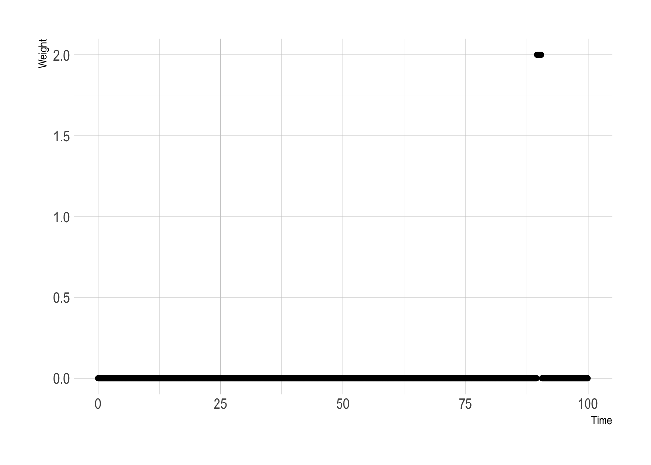
As expected, 1 at 90 and 0 everywhere else.
We can now write the R code for our intensity function, and then the likelihood by combining the intensity and integrated intensity.
intensityFunction <- function(params, t, winProb, maxT){
  beta0 <- params[1]
  beta1 <- params[2]
  beta90 <- params[3]

  int <- (winProb * beta0) + (beta1 * (t/maxT)) + (beta90*diract(t))
  int[int < 0] <- 0
  int
}

intensitFunctionInt <- function(params, maxT, winProb){
  beta0 <- params[1]
  beta1 <- params[2]
  beta90 <- params[3]

  beta0*winProb*maxT + (beta1*maxT)/2 + beta90
}

likelihood <- function(params, t, winProb){
  ss <- sum(log(intensityFunction(params, t, winProb, 90)))
  int <- intensitFunctionInt(params, 90, winProb)
  ss - int
}
We now combine the three functions and simulate a point process from the
intensity function. We will use thinning to simulate the
inhomogeneous intensity. This means generating more points than expected
from a larger intensity, and then choosing what ones remain as a ratio
between the larger intensity and true intensity. For a more in-depth
discussion I’ve written about it previously in my
post.
sim_events <- function(params, winProb){
  lambdaMax <- 1.1*intensityFunction(params, 90, winProb, 90)
  nevents <- rpois(1, lambdaMax*90)
  tstar <- runif(nevents, 0, 90)
  accept_prob <- intensityFunction(params, tstar, winProb, 90) / lambdaMax
  (sort(tstar[runif(length(accept_prob)) < accept_prob]))
}
N <- 100
testParams <- c(3, 2, 2)
testWinProb <- 1

testEvents <- replicate(N, sim_events(testParams, testWinProb))
testWinProbs <- rep_len(testWinProb, N)

trueInt <- intensityFunction(testParams, 0:90, testWinProb, 90)
As we have multiple simulated games, we want to calculate the overall likelihood across the total sample and maximise that likelihood.
alllikelihood <- function(params, events, winProbs){
  ll <- sum(vapply(seq_along(events),
             function(i) likelihood(params, events[[i]], winProbs[[i]]),
             numeric(1)))
  if(ll == -Inf){
    return(-1e9)
  } else {
    return(ll)
  }
}

trueLikelihood <- alllikelihood(testParams, testEvents, testWinProbs)
Simple enough to do the optimisation, chuck the function into optim
and away we go.
simRes <- optim(runif(3), function(x) -1*alllikelihood(c(x[1], x[2], x[3]),
                                             testEvents,
                                             testWinProbs), lower = c(0,0,0), method = "L-BFGS-B")

print(simRes$par)
3.005867 1.995551 1.932193
The parameters come out almost exactly as they were specified.
simResDF <- data.frame(Time = 0:90,
                     TrueIntensity = trueInt,
                     EstimatedIntensity = intensityFunction(simRes$par, 0:90, testWinProb, 90))

ggplot(simResDF, aes(x=Time, y=TrueIntensity, color = "True")) +
  geom_line() +
  geom_line(aes(y=EstimatedIntensity, color = "Estimated")) +
  labs(color = NULL) +
  xlab("Time") +
  ylab("Intensity") +
  theme(legend.position = "bottom")
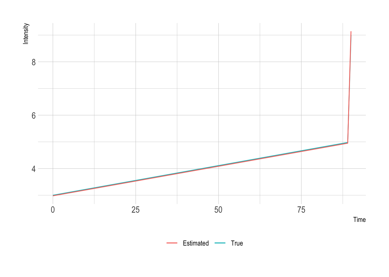
Okay, so our method is good. We’ve recovered all three factors in the intensity so well that you can hardly tell the difference between the real and estimated intensities. So we can now go on looking at our data.
Optimising over our football data
Let’s do the train/test split and fit our model on the training data.
trainInds <- sample.int(length(allGoalTimes), size = floor(length(allGoalTimes)*0.7))

goalTimesTrain <- allGoalTimes[trainInds]
strengthTrain <- allStrengths[trainInds]

goalTimesTest <- allGoalTimes[-trainInds]
strengthTest <- allStrengths[-trainInds]
We start by using a null model. This is where we will just use the constant parameter and the team strengths and see how well that fits the data.
optNull <- optim(runif(1), function(x) -1*alllikelihood(c(x[1], 0, 0),
                                                       goalTimesTrain,
                                                       strengthTrain), lower = c(0,0,0), method = "L-BFGS-B")
optNull
We add in the next parameter, the linear trend.
optNull2 <- optim(runif(2), function(x) -1*alllikelihood(c(x[1], x[2], 0),
                                                       goalTimesTrain,
                                                       strengthTrain), lower = c(0,0,0), method = "L-BFGS-B")
optNull2
We can now use all the features previously described and fit the full model across the data.
optRes <- optim(runif(3), function(x) -1*alllikelihood(x,
                                                       goalTimesTrain,
                                                       strengthTrain), lower = c(0,0,0), method = "L-BFGS-B")
optRes
And then just to check, let’s remove the linear parameter.
optRes2 <- optim(runif(2), function(x) -1*alllikelihood(c(x[1], 0, x[2]),
                                                       goalTimesTrain,
                                                       strengthTrain), lower = c(0,0,0), method = "L-BFGS-B")
optRes2
Putting all the results into a table lets us compare nicely.
| Model | \(\beta _0\) | \(\beta _1\) | \(\beta _{90}\) |
|---|---|---|---|
| Constant | 0.0039 | —– | —– |
| Linear | 0.0006 | 0.025 | —– |
| Delta | 0.00096 | 0.022 | 0.05 |
| No Linear | 0.0037 | —– | 0.06 |
The positive linear parameter (\(\beta _1\)) shows that there is an increase in probability towards the end of the match.
It is easier to compare the resultant intensity functions though.
modelFits <- data.frame(Time = 0:90)
modelFits$Null <- intensityFunction(c(optNull$par[1],0,0), modelFits$Time, 2, 90)
modelFits$Linear <- intensityFunction(c(optNull2$par ,0), modelFits$Time, 2, 90)
modelFits$Delta <- intensityFunction(optRes$par, modelFits$Time, 2, 90)
modelFits$NoLinear <- intensityFunction(c(optRes2$par[1], 0, optRes2$par[2]), modelFits$Time, 2, 90)

modelFits %>%
  pivot_longer(!Time, names_to="Model", values_to="Intensity") -> modelFitsTidy

ggplot(modelFitsTidy, aes(x=Time, y=Intensity, color = Model)) +
  geom_line() +
  theme(legend.position = "bottom")
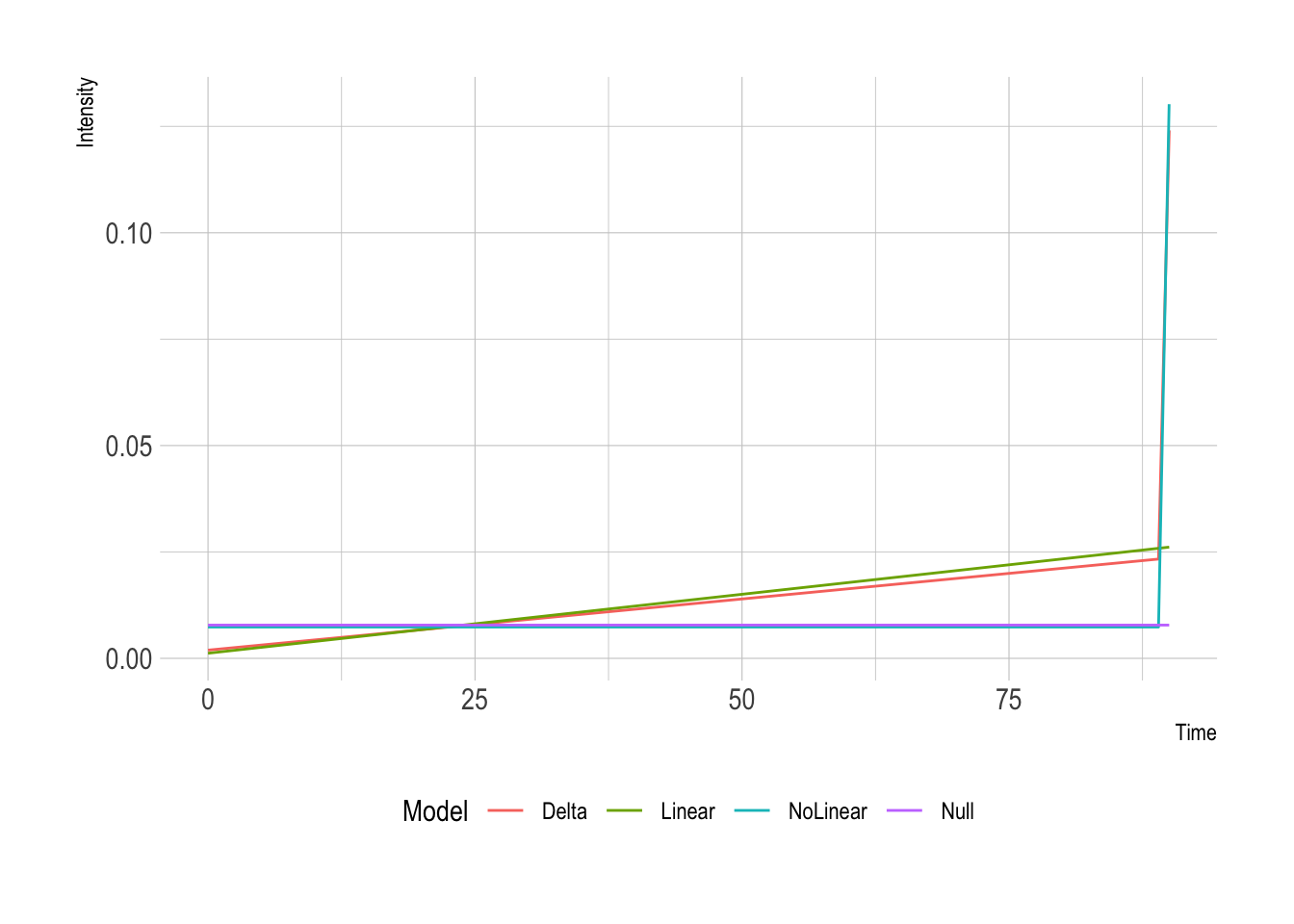
So interesting differences between the three different models. Model 2 has a lower slope because it can accommodate the spike at the end. When looking at the final likelihoods from the models:
| Model | Out of Sample Likelihood |
|---|---|
| Constant | -55337.35 |
| Linear | -52268.48 |
| Delta | -51917.7 |
| No Linear | -54500.6 |
So, the best fitting model (largest likelihood) is the Delta model, so that 90-minute spike is doing some work. Also shows that the linear component of the model contributes something to the model as the No Linear result has a worse likelihood.
Using the likelihood to evaluate the model is only one approach though. We could go further with BIC/AIC/DIC values but given there are only three parameters in the model it probably won’t be instructive. Instead, we should look at what the model simulates results like.
We go through each of the test set matches and simulate a match 100 times, taking the maximum number of goals scored, we then compare this to the maximum observed number of goals across the data set and see how the distributions compare.
This is similar to the posterior p-values method for model checking but in this case slightly different because we do not have a chain of parameters and just the optimised values.
maxGoals <- vapply(strengthTest,
       function(x) max(replicate(100, length(sim_events(optRes$par, x)))),
       numeric(1))

actualMaxGoals <- max(vapply(allGoalTimes, length, numeric(1)))
ggplot(data = data.frame(MaxGoals = maxGoals), aes(x=MaxGoals)) +
  geom_histogram(binwidth = 1) +
  geom_vline(xintercept = actualMaxGoals) +
  xlab("Maximum Number of Goals")
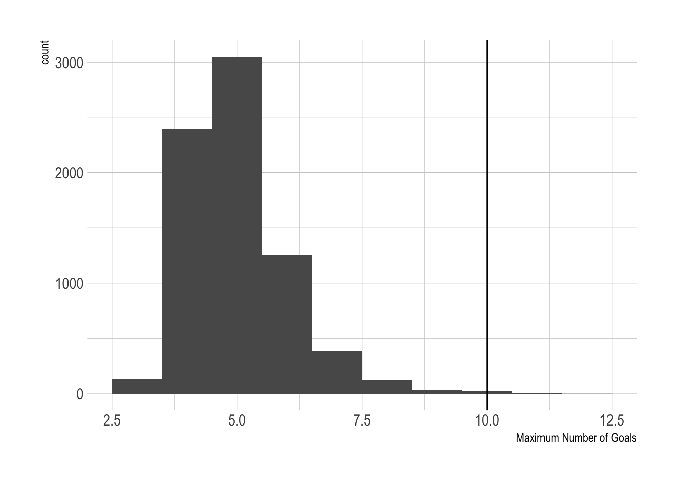
10 is the largest number of goals observed, and our model congregates around 5 as the maximum, but we did see 2 simulations with 10 goals, and another 2 more with 10+ goals. So overall, the model can generate something that resembles reality, if not infrequently. But then again, how often do we see 10-goal games?
Conclusion and Next Steps
Overall this is a nice little model that shows the probability of a team scoring appearing to increase linearly over time. We added in a delta function to account for the fact that some games go beyond 90 minutes and many goals are scored in that period. We then did some model checking by simulating using the fitted parameters and it turns out the model can generate large enough amounts of goals compared to the real data.
I’ve fitted this model by optimising the likelihood, so the next logical step would be to take a Bayesian approach and throw the model into Stan so we have a proper sample of parameters that lets us judge the uncertainty around the model a bit better. Then the next direction would be to relax the linearity of the model throw a non-parametric approach at the data and see if anything interesting turns up. I have been trying this with my dirichletprocess package, but never managed to get a satisfying result that improved the above. Plus with the large dataset, it was taking forever to run. Maybe a blog post for the future!